Pagination
Pagination allows users to navigate through large amounts of content or data divided across multiple pages while making it clear that more pages exist.
Anatomy
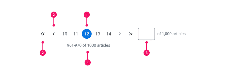
- Page Numbers: Each page has its own page number. All page numbers inherit styling and interactions from our Icon Only Primary Button Variant.
- Navigational Controls: Allow users to navigate through available pages. These controls inherit styling and interactions from our Icon Only Tertiary Button. Previous/Next uses Small Chevron System Icon and First/Last uses Chevron x2 Small System Icon.
- Input w/ Label: Shows a box adjacent to the pagination bar where a page can be entered and is submitted when 'Enter' key is pressed. Enables users to jump to specific page. Input uses the Canvas Text Input with browser-specific numeric input override.
- Additional Details: Communicates the number of pages and total number of items. Page numbers are separated by an en dash. The word “pages” is customizable.
Pagination is a highly configurable component so we’ve intentionally built each piece of this component separately so you may compose it in a variety of ways.
Usage Guidance
- Pagination is a highly configurable navigation component composed of the following elements:
- Page Numbers: Provide context about what page the user is on in relation to other pages.
- Page Navigation: Navigational controls allow users to navigate back or forward through pages. If applicable, they are also able to jump to the first or last page.
- Numeric Input: Enables users to jump to a specific page.
- Label: Communicates the number of pages and total number of items. The word “items” is customizable.
- Although the component is typically placed below the corresponding content or data, there is flexibility on placement depending on your use case.
- Pagination is typically used with Tables.
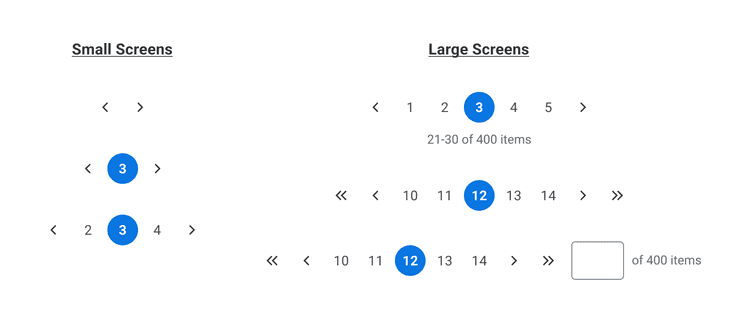
- In responsive experiences, Pagination condenses to its most basic elements (Left/Right Controls, Current Page Number).
When to Use
- To divide large quantities of data or content into chunks.
- To improve the loading performance of a system.
- To make user comprehension of data/content less overwhelming.
- To enable all users to navigate to through pages or locate a specific page number.
- To show how many pages of content there are and how many results have been returned.
Best Practices
- Display at least one way for users to navigate through pages. If possible, provide more than one option (eg. Previous/Next controls and a Numeric Input).
- Display the Current Page to provide awareness of location in relation to the other pages.
- If feasible, display additional details (number of pages and total number of items) to communicate even more context about the content or data the user is paging through.
Each element of Pagination has been built separately so you may compose it in a variety of ways. How you decide to put this component together will likely depend on the reality of the technical constraints that exist and your user needs.
Below are some examples of how you can configure Pagination based on screen size or technical considerations. These recommendations are not exhaustive.
Based on Screen Size:
- For smaller screens, it’s recommended to show page navigation controls with no more than 3 pages.
- For larger screens, you can show up to 5 pages, both types of page navigation controls, and a numeric input with additional details.
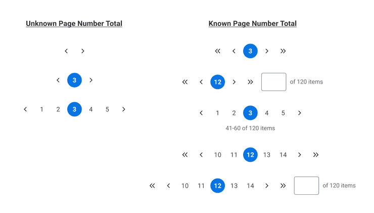
Based on Technical Considerations:
- If your API is unable to return a total page number, we recommend showing the Previous/Next page navigation controls, the Current Page Number, and up to 4 other Page Numbers (if possible).
- If your API is able to return a known number of pages, composability options are endless. You can essentially pair any combination of elements together to create a solution that is best for your use case.
Examples
Basic Example
Pagination includes a container Pagination component and a number of subcomponents which can be
composed in a variety of ways.
In this example, we set up a basic Pagination component with the default range of five pages, as
well as step controls (Pagination.StepToPreviousButton and Pagination.StepToNextButton) that
allow you to move to the previous page or the next page.
Note that you must include Pagination.AdditionalDetails to meet accessibility standards (with one
exception, see Pagination.AdditionalDetails for more information).
It is an aria-live region that announces the current page update to screen readers. If you wish to
prevent it from displaying (as we've done in the remaining examples), you may set its
shouldHideDetails prop to true. The visually hidden region will still be accessible to screen
readers.
Hoisted Model
By default, Pagination will create and use its own model internally. Alternatively, you
may configure your own model with usePaginationModel and pass it to Pagination via the model
prop. This pattern is referred to as
hoisting the model
and provides direct access to its state and events outside of the Pagination component.
In this example, we set up external observation of the model state and create an external button to trigger an event to change the current page.
Jump Controls
This example adds jump controls (Pagination.JumpToFirstButton and Pagination.JumpToLastButton)
that allow you to skip to the first and last pages in the range.
GoTo Form
This example adds a form (Pagination.GoToForm) that allows you to skip to a specific page within
the range.
Right-to-Left (RTL)
Pagination supports right-to-left languages when specified in the CanvasProvider theme.
Custom Range
This example uses a custom range that allows you to control the width of the component.
Responsive Range
In some situations, you might want to adjust Pagination's range based on the width of the container.
You can use useResizeObserver to accomplish this as in the example below.
Component API
Pagination
Pagination is a container component rendered as a <nav> element that is responsible for creating
a PaginationModel and sharing it with its subcomponents using React context.
<Paginationaria-label="Pagination"lastPage={100}initialCurrentPage={6}rangeSize={3}onPageChange={pageNumber => console.log(pageNumber)}>{Child components}</Pagination>
Alternatively, you may pass in a model using the hoisted model pattern.
const model = usePaginationModel({lastPage: 100,initialCurrentPage: 6,rangeSize: 3,onPageChange: pageNumber => console.log(pageNumber),});return (<Pagination aria-label="Pagination" model={model}>{Child components}</Pagination>);
Layout Component
Pagination supports all props from thelayout component.
Props
Props extend from nav. Changing the as prop will change the element interface.
| Name | Type | Description | Default |
|---|---|---|---|
aria-label | string | ||
cs | | The
| |
children | ReactNode | ||
lastPage | number | ||
firstPage | number | ||
initialCurrentPage | number | ||
rangeSize | number | ||
model | | ||
onPageChange | (pageNumber: number) => void | ||
as | React.ElementType | Optional override of the default element used by the component. Any valid tag or Component. If you provided a Component, this component should forward the ref using Note: Not all elements make sense and some elements may cause accessibility issues. Change this value with care. | nav |
ref | React.Ref<R = nav> | Optional ref. If the component represents an element, this ref will be a reference to the real DOM element of the component. If |
Pagination.Controls
Pagination.Controls provides proper alignment and spacing between elements inside
Pagination. It does not handle any internal business logic or state.
<Pagination.Controls>{Child components}</Pagination.Controls>
Props
Props extend from div. Changing the as prop will change the element interface.
| Name | Type | Description | Default |
|---|---|---|---|
children | React.ReactNode | ||
as | React.ElementType | Optional override of the default element used by the component. Any valid tag or Component. If you provided a Component, this component should forward the ref using Note: Not all elements make sense and some elements may cause accessibility issues. Change this value with care. | div |
ref | React.Ref<R = div> | Optional ref. If the component represents an element, this ref will be a reference to the real DOM element of the component. If |
Pagination.JumpToFirstButton
Basic type information:
JumpToFirstButtonPagination.StepToPreviousButton
Basic type information:
StepToPreviousButtonPagination.StepToNextButton
Basic type information:
StepToNextButtonPagination.JumpToLastButton
Basic type information:
JumpToLastButtonPagination.PageList
Basic type information:
PageListPagination.PageListItem
Basic type information:
PageListItemPagination.PageButton
Basic type information:
PageButtonPagination.GoToForm
Basic type information:
GoToFormPagination.GoToTextInput
Basic type information:
GoToTextInputPagination.GoToLabel
Basic type information:
GoToLabelPagination.AdditionalDetails
Basic type information:
AdditionalDetailsModel
If Pagination was stripped of all its markup, attributes, and styling, what would remain is the
model. The model is an
object composed of two parts: state which describes the current snapshot in time of the component
and events which describes events that can be sent to the model.
By default, Pagination will create a model and share it internally with its subcomponents using
React context. You may subscribe to PaginationContext if you wish to create a custom subcomponent
for your implementation. Here's a simple example.
import * as React from 'react';import {Pagination, PaginationContext} from '@workday/canvas-kit-react/pagination';const CustomButton = (props: React.HTMLAttributes<HTMLButtonElement>) => {const model = React.useContext(PaginationContext);const handleClick = (e: React.MouseEvent<HTMLButtonElement, MouseEvent>) => {// If onClick is provided, pass the event alongprops.onClick?.(e);model.events.goTo(10);};return (<button onClick={handleClick} {...props}>Go To Page 10</button>);};export const CustomPagination = () => {return (<Pagination aria-label="Pagination" lastPage={20}><CustomButton aria-label="Page 10" />{/* Other subcomponents */}</Pagination>);};
Alternatively, if you need direct access to the model's state and events outside of the
Pagination component, you may configure your own model with usePaginationModel and pass it to
Pagination via a pattern called
hoisting the model.
const model = usePaginationModel({lastPage,onPageChange: number => console.log(number),});<Pagination aria-label="Pagination" model={model}>{/* Child components */}</Pagination>;
usePaginationModel
usePaginationModel accepts a configuration object with the following properties and returns a
PaginationModel with state and events properties.
Utilities
getLastPage
getLastPage
This function takes the number of results per page and the total count of results and returns the last page number. Here's an example:
Given there are 10 results per page, and there are 128 total results, the function will return 13.
const lastPage = getLastPage(10, 128); //=> 13
(
  resultCount: number,
  totalCount: number
) => number
getRangeMin
getRangeMin
This function takes the pagination range and returns its minimum value. Here's an example:
Given the pagination range is 1-5, the function will return 1.
const range = [1, 2, 3, 4, 5];const rangeMin = getRangeMin(range); //=> 1
(range: number[]) => numbergetRangeMax
getRangeMax
This function takes the pagination range and returns its maximum value. Here's an example:
Given the pagination range is 1-5, the function will return 5.
const range = [1, 2, 3, 4, 5];const rangeMin = getRangeMax(range); //=> 5
(range: number[]) => numbergetVisibleResultsMin
getVisibleResultsMin
This function takes the current page, and number of results per page, and returns the minimum value for that page. Here's an example:
Given there are 10 results per page, and the current page is 5, the function will return 41.
const pageMin = getVisibleResultsMin(5, 10); //=> 41
(
  currentPage: number,
  resultCount: number
) => number
getVisibleResultsMax
getVisibleResultsMax
This function takes the current page, number of results per page, and the total number of results, and returns the maximum value for that page. Here's an example:
Given there are 10 results per page, the current page is 5, and there are 42 results total, the function will return 42.
const currentPage = 5;const resultCount = 10;const totalCount = 42;const pageMax = getVisibleResultsMax(currentPage, resultCount, totalCount); //=> 42
(
  currentPage: number,
  resultCount: number,
  totalCount: number
) => number
Accessibility Guidelines
How Pagination Impacts the Accessible Experience
Pagination controls can be a more accessible alternative to infinitely scrolling content which may introduce accessibility barriers for some users. Respecting users’ preference for how much content they’d like to consume at one time sets the stage for more accessible UI and reducing cognitive load.
For screen readers, users are going to expect a confirmation, or validation, that the screen has been updated after interacting with Pagination controls. This has been historically accomplished by HTTP requests that refresh the page and reset users to the top of the screen. Today, this can be accomplished by setting keyboard focus to a target above the updated content, or by leveraging ARIA live region status updates.
Keyboard Interaction
Each Pagination component must have a focus indicator that is highly visible against the background and against the non-focused state. Refer to Accessible Colors for more information.
Pagination must support the following keyboard interactions:
Tab: focus each button in the Pagination componentEnterorSpace: activate the focused button
Screen Reader Interaction
Pagination must communicate the following to users:
- Pagination is a navigation landmark that can be distinguished from other navigation landmarks provided on a page.
- Which page is actively selected in Pagination, out of the total number of pages available.
- The screen content has been updated after selecting a different page.
Design Annotations Needed
- Write the accessible names of each icon button in Pagination
- Write the label for the text input in the pagination component
Implementation Markup Needed
- Use accessible tooltips to show the icon button’s name for everyone.
The
Tooltipcomponent will apply the text automatically as anaria-labelfor the icon button. - When not using the
Tooltipcomponent, assigning anaria-labelstring is required for icon-only buttons and the GoTo Form text input. - Set keyboard focus to a target at the top of the updated content after users interact with Pagination controls.
- Set
aria-describedbyproperty on the GoTo Form text input, referencing the uniqueidof the GoTo Form label. - [Included in component] Pagination container must be a
<nav>element with anaria-labelstring describing Pagination context. For example, “Search results” when paginating a list of search results. - [Included in component] Pagination must be structured as a semantic ordered list of button elements.
- [Included in component] The Next and Previous page controls must use the
aria-disabledproperty when those controls are unavailable. - [Included in component] The currently selected page control must use the
aria-currentproperty. - [Included in component] The Additional Details text below Pagination must use the
role=”status”,aria-live=”polite”, andaria-atomic=”true”properties for real-time updates to screen readers.
Content Guidelines
- If customizing the label of the total number of items, use a word that accurately describes the items that are being shown.
- Placement of the label is flexible.
Can't Find What You Need?
Check out our FAQ section which may help you find the information you're looking for.
FAQ Section


