Segmented Control
Segmented Control displays different views of the same content.
Segmented Control (Main) vs. Segmented Control (Preview)
We recommend you use the Segmented Control in the Preview package
(@workday/canvas-kit-preview-react) documented here on this page. The Segmented Control in the
Main package (@workday/canvas-kit-react) will eventually be replaced with the Segmented Control in
the Preview package.
Anatomy
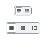
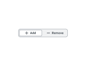
- Active Button: Only one segment can be active at a time. These mutually exclusive Buttons can appear as icon only, text left, or icon left with text.
- Default Buttons: Default control options that can be customized.
- Alignment: The Icon Only variant can be arranged horizontally or vertically.
Usage Guidance
- Only one control option can be selected and active at a time.
- Once a user selects an option, the results should be displayed immediately.
- Each Button must clearly identify its purpose. Text variants will already have their labels displayed visually, but tooltips should be used for icon only variants.
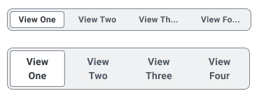
- All the buttons in the group to be the same size regardless of text length. Length of segments is determined by the longest text label.
When to Use
- Use Segmented Control to switch between alternate views of similar or related content.
- Use icon-only variant when there is limited space or when the icons are intuitive and easy to understand.
When to Use Something Else
- Use Tabs to display different, unrelated content.
- Use Hyperlinks within a paragraph to navigate to another page. See the Button or Hyperlink section of the Buttons and Calls to Action pattern for more information and best practices.
- Use Checkboxes when the user is able to select multiple values from a predefined list of 7 or less options.
- Use Multi-select Prompts when the user is able to select multiple values from a predefined list of more than 7 options.
- Use Radio when the user is able to select a single value from a predefined list of 2 to 7 options that will not alter the page content.
- Use Single-select Prompts when the user is able to select a single value from a predefined list of more than 7 options that will not alter the page content. Alternatively, Select can also be used when there are 7 to 15 single-select options.
Dos and Don’ts
Do
Labels should be short and succinct. If a label is too long to fit within its segment, consider using an icon- only variant.
Do
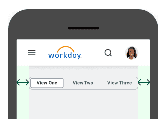
Segmented buttons should have adequate margins from the edge of the viewport or frame. The container shouldn’t reach the edge of the viewport.
Examples
Basic Example
SegmentedControl includes a container SegmentedControl component and the following
subcomponents: SegmentedControl.List and SegmentedControl.Item.
The example below contains a SegmentedControl with four icon-only buttons. Each button is rendered
using a SegmentedControl.Item and is paired with a tooltip describing the button's function. Only
one button can be active at a time.
Selected: table
Note that you must provide SegmentedControl.List with an aria-label prop for accessibility
reasons.
We strongly discourage including more than four buttons in a single SegmentedControl.
Variations
SegmentedControl supports three variations based on whether or not its SegmentedControl.Item
components have an icon prop and/or text content: icon-only, text-only, and text-and-icon.
All SegmentedControl.Item components within a given SegmentedControl must be of the same
variation.
Icon-Only
To render an icon-only SegmentedControl, apply the icon prop to SegmentedControl.Item and do
not provide it with text content. Refer to the basic example above for an instance
of an icon-only SegmentedControl.
The icon-only variation is the only variation which supports a vertical orientation in addition to
the default horizontal orientation. Set the orientation prop of SegmentedControl to vertical
to configure the component to render vertically.
Text-Only
To render a text-only SegmentedControl, omit the icon prop from SegmentedControl.Item and
provide it with text content.
Text-and-Icon
To render a text-and-icon SegmentedControl, apply the icon prop to SegmentedControl.Item and
provide it with text content.
Sizes
SegmentedControl accepts a size prop which supports the following values:
smallmedium(Default)large
Small
Medium
Large
Disabled
Set the disabled prop of SegmentedControl to disable the entire component including its buttons.
Right-to-Left (RTL)
SegmentedControl supports right-to-left languages when specified in the CanvasProvider theme.
Dynamic Items
SegmentedControl supports a
dynamic API where instead
of statically providing the JSX for each SegmentedControl.Item, you pass an array of items in
the model state and provide a render function to display the items.
Component API
SegmentedControl
SegmentedControl is a container component that is responsible for creating a
and sharing it with its subcomponents using React context. It does
not represent a real element.
<SegmentedControl items={[]}>{Child components}</SegmentedControl>
Alternatively, you may pass in a model using the hoisted model pattern.
const model = useSegmentedControlModel({items: [],});<SegmentedControl model={model}>{Child components}</SegmentedControl>;
Props
Props extend from . If a model is passed, props from SegmentedControlModelConfig are ignored.
| Name | Type | Description | Default |
|---|---|---|---|
children | ReactNode | ||
model | | Optional model to pass to the component. This will override the default model created for the component. This can be useful if you want to access to the state and events of the model, or if you have nested components of the same type and you need to override the model provided by React Context. | |
elemPropsHook | ( | Optional hook that receives the model and all props to be applied to the element. If you use this, it is your responsibility to return props, merging as appropriate. For example, returning an empty object will disable all elemProps hooks associated with this component. This allows finer control over a component without creating a new one. |
SegmentedControl.List
SegmentedControl.List renders under the hood. It is a container for
subcomponents.
<SegmentedControl.List>{SegmentedControl.Items}</SegmentedControl.List>
Layout Component
SegmentedControl.List supports all props from thelayout component.
Props
Props extend from div. Changing the as prop will change the element interface.
| Name | Type | Description | Default |
|---|---|---|---|
aria-label | string | ||
children | ((item: T) => ReactNode) | ReactNode | ||
cs | | The
| |
as | React.ElementType | Optional override of the default element used by the component. Any valid tag or Component. If you provided a Component, this component should forward the ref using Note: Not all elements make sense and some elements may cause accessibility issues. Change this value with care. | div |
ref | React.Ref<R = div> | Optional ref. If the component represents an element, this ref will be a reference to the real DOM element of the component. If | |
model | | Optional model to pass to the component. This will override the default model created for the component. This can be useful if you want to access to the state and events of the model, or if you have nested components of the same type and you need to override the model provided by React Context. | |
elemPropsHook | ( | Optional hook that receives the model and all props to be applied to the element. If you use this, it is your responsibility to return props, merging as appropriate. For example, returning an empty object will disable all elemProps hooks associated with this component. This allows finer control over a component without creating a new one. |
useSegmentedControlList
(
model: ,
elemProps: {},
ref: React.Ref
) => {
opacity: number | undefined;
}SegmentedControl.Item
SegmentedControl.Item is a button element built on BaseButton. SegmentedControl.Item
has a data-id prop to handle onSelect properly.
<SegmentedControl.Item data-id="table">Table</SegmentedControl.Item>
Layout Component
SegmentedControl.Item supports all props from thelayout component.
Props
Props extend from button. Changing the as prop will change the element interface.
| Name | Type | Description | Default |
|---|---|---|---|
index | number | Optionally pass index to the item. This should be done if | |
children | ReactNode | The contents of the item. This is text used as the accessible name of the button for screen readers. | |
data-id | string | The identifier of the item. This identifier will be used in change events and for | |
id | string | Optional id. If not set, it will inherit the ID passed to the | |
aria-pressed | boolean | Part of the ARIA specification for buttons. Lets screen readers know which button is active. This
should either be | |
icon | | The icon of the button. | |
tooltipProps | <, 'children'> | Tooltip Props | |
colors | | Override default colors of a button. The default will depend on the button type | |
size | | There are four button sizes: | |
fillIcon | boolean | Whether the icon should received filled (colored background layer) or regular styles.
Corresponds to | |
iconPosition | | Button icon positions can either be | 'start' |
shouldMirrorIcon | boolean | If set to | false |
accent | string | The accent color of the SystemIcon. This overrides | |
accentHover | string | The accent color of the SystemIcon on hover. This overrides | |
background | string | The background color of the SystemIcon. | |
backgroundHover | string | The background color of the SystemIcon on hover. | |
color | string | The color of the SystemIcon. This defines | |
colorHover | string | The hover color of the SystemIcon. This defines | |
fill | string | The fill color of the SystemIcon. This overrides | |
fillHover | string | The fill color of the SystemIcon on hover. This overrides | |
shouldMirror | boolean | If set to | false |
cs | | The
| |
grow | boolean | True if the component should grow to its container's width. False otherwise. | |
as | React.ElementType | Optional override of the default element used by the component. Any valid tag or Component. If you provided a Component, this component should forward the ref using Note: Not all elements make sense and some elements may cause accessibility issues. Change this value with care. | button |
ref | React.Ref<R = button> | Optional ref. If the component represents an element, this ref will be a reference to the real DOM element of the component. If | |
model | | Optional model to pass to the component. This will override the default model created for the component. This can be useful if you want to access to the state and events of the model, or if you have nested components of the same type and you need to override the model provided by React Context. | |
elemPropsHook | ( | Optional hook that receives the model and all props to be applied to the element. If you use this, it is your responsibility to return props, merging as appropriate. For example, returning an empty object will disable all elemProps hooks associated with this component. This allows finer control over a component without creating a new one. |
Model
Specifications
| Given | When | Then |
|---|---|---|
| the Basic story is rendered |
| |
| the Basic story is rendered |
| |
| the Basic story is rendered |
| |
| the Basic story is rendered |
| |
| the Basic story is rendered |
| |
| the Basic story is rendered |
| |
| the Basic story is rendered |
| |
| the Basic story is rendered |
| |
| the Basic story is rendered |
|
|
| the Basic story is rendered |
|
|
| the Basic story is rendered |
|
|
| the Basic story is rendered |
|
|
| the Basic story is rendered |
|
|
| the Basic story is rendered |
|
|
| the Basic story is rendered |
|
|
| the Basic story is rendered |
|
|
| the Vertical story is rendered |
| |
| the Vertical story is rendered |
| |
| the Vertical story is rendered |
| |
| the Vertical story is rendered |
| |
| the Vertical story is rendered |
| |
| the Vertical story is rendered |
| |
| the Vertical story is rendered |
| |
| the Vertical story is rendered |
| |
| the Vertical story is rendered |
|
|
| the Vertical story is rendered |
|
|
| the Vertical story is rendered |
|
|
| the Vertical story is rendered |
|
|
| the Vertical story is rendered |
|
|
| the Vertical story is rendered |
|
|
| the Vertical story is rendered |
|
|
| the Vertical story is rendered |
|
|
| the Disabled story is rendered |
| |
| the Disabled story is rendered |
| |
| the Disabled story is rendered |
|
|
| the rtl story is rendered |
|
|
| the rtl story is rendered |
|
|
| the rtl story is rendered |
|
|
| the rtl story is rendered |
|
|
| the rtl story is rendered |
|
|
| the rtl story is rendered |
|
|
Accessibility Guidelines
Keyboard Interaction
Each button in the Segmented Control must have a focus indicator that is highly visible against the background and against the non-focused state. Refer to Accessible Colors for more information.
Segmented Control must support the following keyboard interactions:
Tab: focus each button elementEnterorSpace: activate focused button element
Screen Reader Interaction
Segmented Control must communicate the following to users:
- The Buttons in the control are related to one another, and part of a group
- The functionality of each Button in the set (E.g. “Day View” or “List View” communicate functionality)
- Which Button in the set is currently selected
Design Annotations Needed
- Accessible name for the group describing the purpose of the Segmented Control
- When using Icon Only Button, an accessible name for each Icon Button in the Segmented Control
Implementation Markup Needed
- An ARIA
role=”group”attribute is used for grouping the button elements together, then use anaria-labelstring to clearly describe the purpose of the segmented control - Icons used in text buttons may be considered redundant or decorative. Alternative text is most likely unnecessary, and not recommended
- Icon-only buttons must have an
aria-labelstring, and can be paired with an accessible tooltip that displays both on hover and focus - [Included in component] All buttons are required to have an
aria-pressed="false"attribute, except for the currently selected button set to a value of“true”
Content Guidelines
- If the content exceeds the specified max-width, consider making your labels more concise, or use an icon-only variant.
- Text in a segmented control should never truncate or wrap.
- See the Buttons and Calls to Action page in the UI Text section of the Content Style Guide for button language guidelines.
- When writing Tooltips to pair with Segmented Control, refer to the Tooltips section of the Content Style Guide.
Can't Find What You Need?
Check out our FAQ section which may help you find the information you're looking for.
FAQ Section


