Calls to Action
Calls to Action include Buttons and other elements which prompt user interaction.
Guidance
Calls to action are interactive UI elements that prompt user engagement. The size, alignment, and placement of these elements combine to not only show users what to interact with, but convey the level of importance with which to do so.
Size
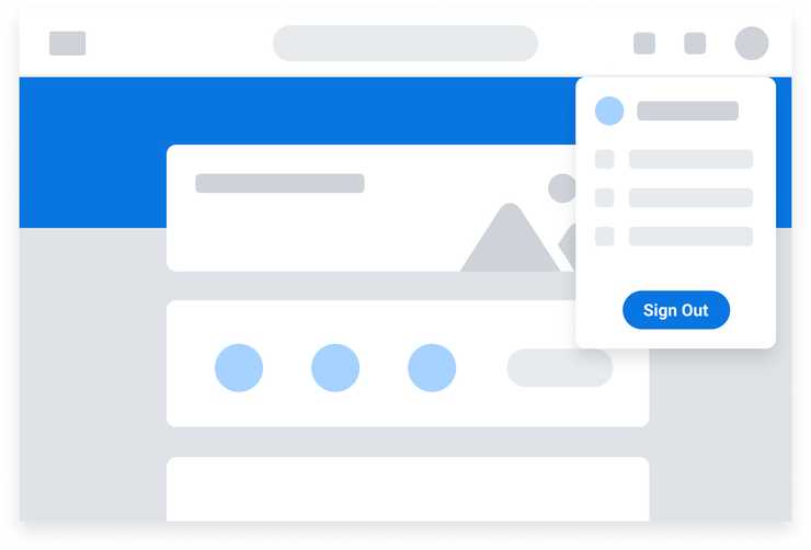
- Users will naturally focus on the largest element with the strongest visual weight over smaller, less punchy ones within a given space. Thus, it’s important to use calls to action intentionally to bring attention to key actions over others that are less important.
- The size of Buttons and other call to action elements should be proportional to the context and content around it.
- Buttons should not be so large as to be visually overwhelming but also large enough to interact with.
Alignment
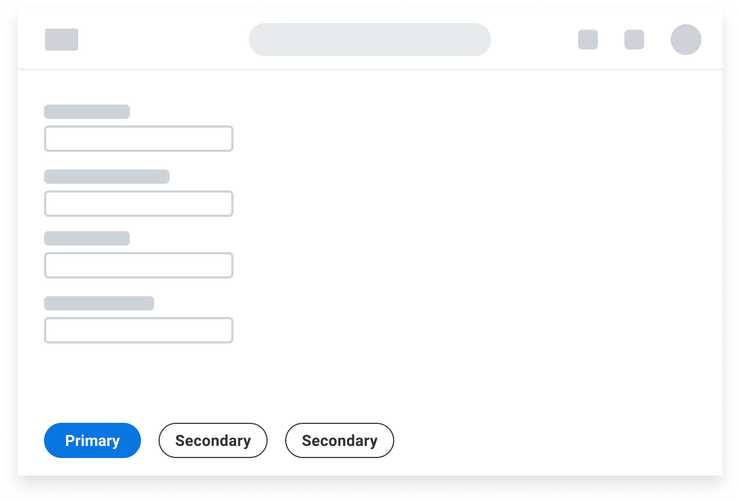
Left Alignment
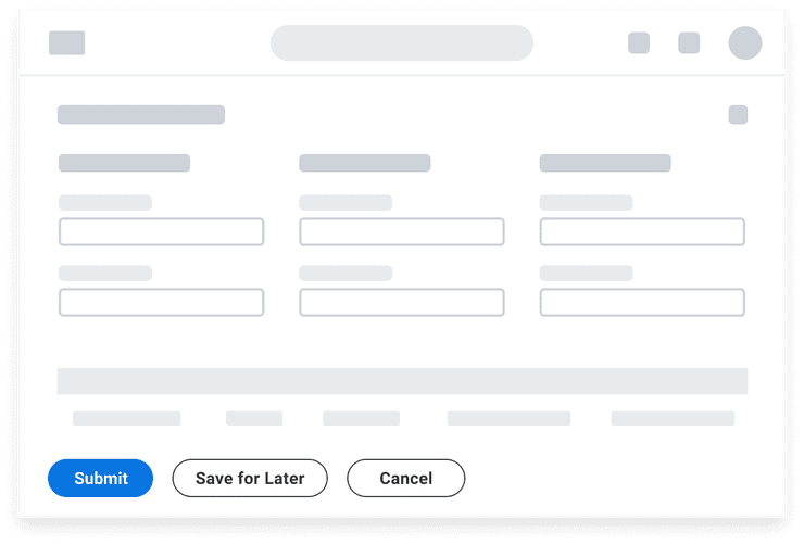
Left-align Buttons for single-page forms and full-page, focused tasks, and sort by importance from left to right. This arrangement supports an F-pattern (top to bottom and left to right in a horizontal direction) optimal for processing through forms.
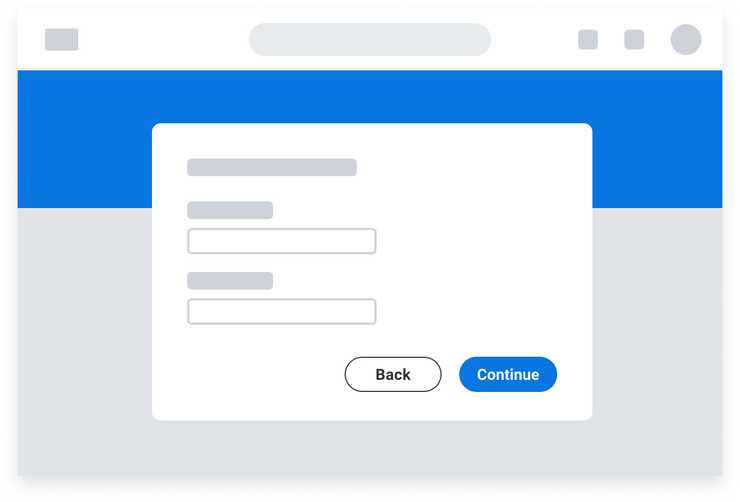
Right Alignment
Right-alignment places the primary Button in the direction of forward-progressing movement. They are commonly used in a series of sequential Modals where a user is progressing through a series of steps.
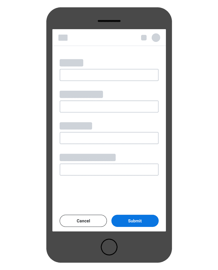
Button alignment should be the same on mobile as on desktop. However, when placed in an Action Bar, the Primary Button should be on the far right, with Secondary Buttons on the left.
Center Alignment
Consider center-aligning standalone Buttons in smaller contexts such as Menus, Modal components, and Dialog components.
Placement
Top Placement
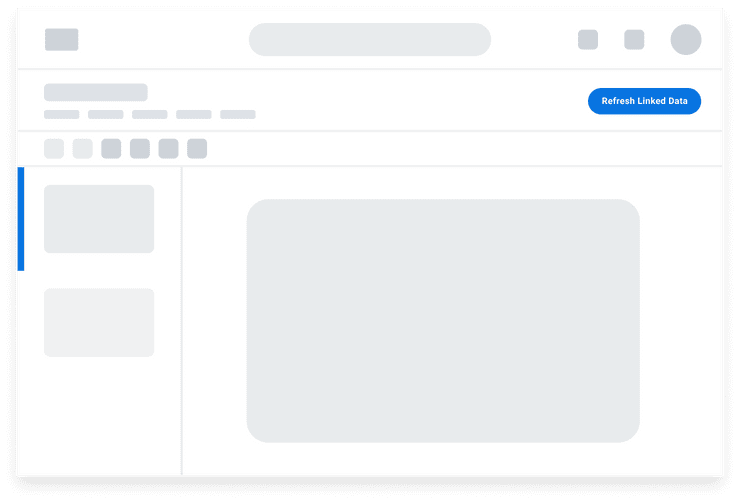
Placing call to action Buttons at the top of a page or container is optimal for actions that you want users to immediately take action on, are of high prominence such as those used to “Add” or “Create”, or actions that affect the contents below it.
Bottom Placement
Place call to action Buttons at the bottom of the page to support F shaped reading patterns on forms. This placement prompts users to process and enter information from top to bottom before acting on the action Buttons to advance in their process, such as submit.
Button Groups
Button groups arrange a series of buttons together horizontally on a single line with equidistant amount of spacing in between.
When vertically stacking buttons:
- Align buttons to the left.
- Display all with the same width.
- Separate with 16px spacing for large and medium size Buttons.
- Separate with 20px spacing for small Buttons.
When arranging buttons horizontally:
- Buttons should be the same size.
- Separate with 16px spacing for all Buttons.
Do’s and Don’ts
Do
- Use Large Buttons for standalone actions.
Don’t
- Don’t use a mix of Secondary or Tertiary Buttons in a Button Group.
- Don’t use Large Buttons when creating a Button Group. Reserve Large Buttons for standalone actions.
Accessibility Considerations
- For guidelines specific to Standard Buttons, see the accessibility documentation under the Usage tab in [Standard Buttons](/components/buttons/standard buttons).
- Text must exceed a contrast ratio of 4.5:1 against the background (see minimum contrast requirement).
Standard Buttons
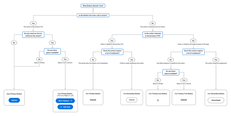
Use the decision tree below as a guide to determine what Button should be used for your use case.
Button or Hyperlink
Hyperlinks
- Always navigate to another page.
- Are underlined in their default state to help users identify them from their surrounding text.
- Often occur within a surrounding block of normal text, such as in paragraphs or lists.
- Have no limits as to how many should be on a page.
Buttons
- Best used for actions that will change data, manipulate how the data is displayed, trigger same-page actions, or change state.
- Common actions include adding, deleting, and refreshing page content or submitting a form.
- Use Tertiary Buttons for standalone actions outside of a paragraph or block of text.
- If using Button styling for navigation, ensure an anchor link is used as the underlying semantic element.
Drop-down Buttons
Drop-down Buttons reduce visual clutter by grouping actions together under the appearance of a single button.
Drop-down Buttons
- Have a single touch point. Clicking anywhere on the Button opens the menu.
- Text label is generic and describes the group of actions in the menu.
- All actions in the menu are of equal emphasis.
- Split Buttons have separate click targets for the primary action and the caret icon which opens a menu of secondary actions. We discourage the use of Split Buttons as they may lead to discoverability issues because users may not notice the caret as a separate touch point.
Common Button Labels
Below are common labels used for Buttons. When creating your own, please refer to the Buttons and Calls to Action page in the UI Text section of the Content Style Guide for button language guidelines.
| Label | When to Use |
|---|---|
| Add | Adds a relationship. To make the action clearer, follow “Add” with the name of the object. Remove is the opposite of Add. |
| Remove | Removes a relationship, but doesn’t permanently delete data. |
| Cancel | Stops an action without saving changes. Cancel is not a destructive action so it should always never be a primary or delete button. |
| Create | Creates a new object. Follow “Create” with the name of the object. Delete is the opposite of Create. |
| Delete | Permanently removes data so the user can no longer retrieve it. |
| Submit | Sends page data for review or processing. |
Common Scenarios
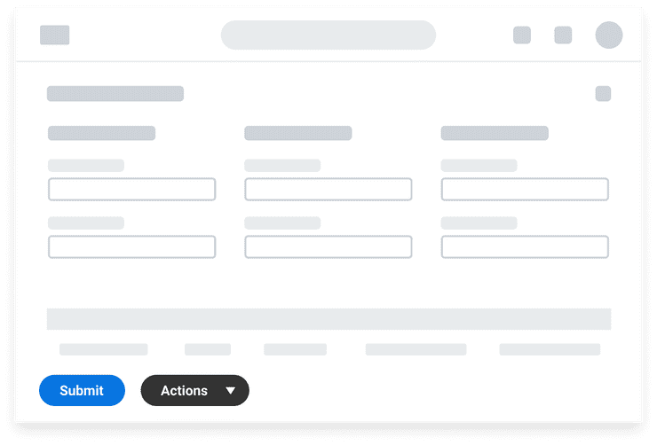
Edit Page with Action Bar
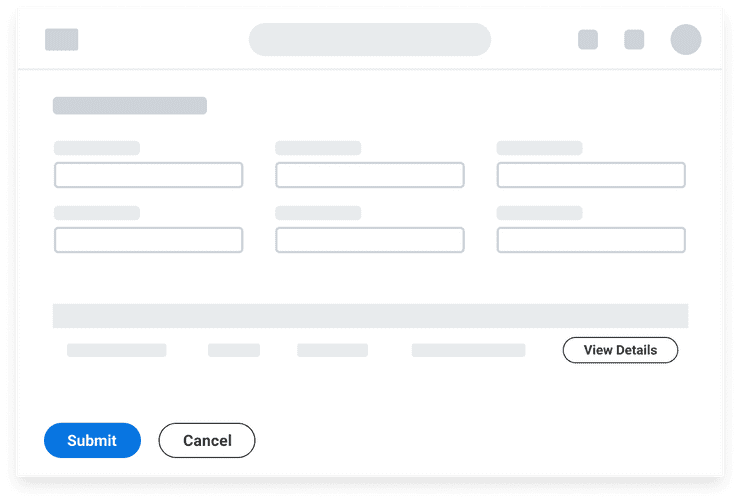
This scenario features a standard edit page with an Action Bar:
- A medium size Primary Button in the Action Bar for Submit. This emphasizes the submit action as the highest priority.
- One Secondary Button in the toolbar for Cancel.
- A small Secondary Button in the Table.
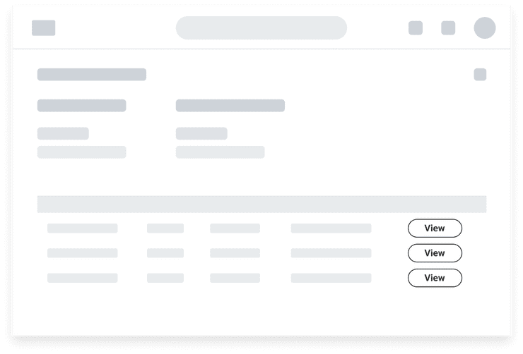
View Page with Secondary Buttons
This scenario features a view page with Secondary Buttons in a Table. Each row in the Table shows a small Secondary Button to view additional details.
Dropdown Button Opens a Menu
Use a Dropdown Button, which leverages a Secondary Button with caret icon, to consolidate actions of equal importance into a menu rather than showing them separately. A good number of actions would be 3 or more, as users will have to perform an additional click to open the menu. If there is a primary action, it should be separated out into its own Primary Button.
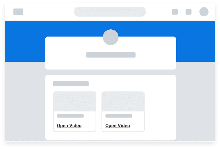
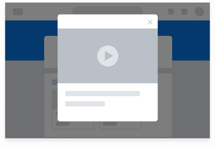
Triggering a new UI component to appear on the page
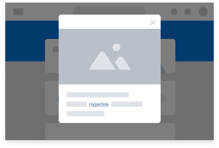
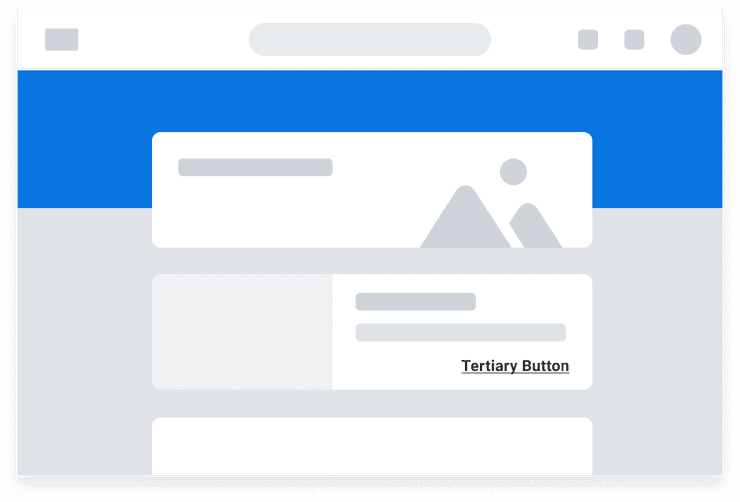
This scenario features Cards with Tertiary Buttons. Activating the Buttons opens a Modal component where the user can play a video.
The card uses a Tertiary Button to maintain emphasis on card content. Because Tertiary Buttons do not have a border, they relate themselves to the component in which they appear.
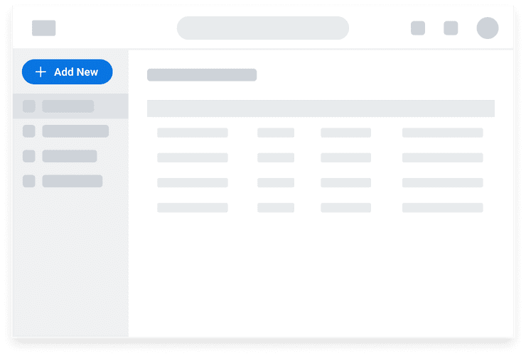
Side Panels
A Primary Button is positioned at the top of the Side Panel, indicating this action is high priority and used for the top for space-wide actions.
Icon Buttons
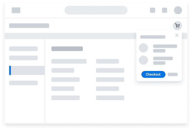
This scenario features an Icon Button and a primary Button in a Dialog component:
- Using a shopping cart icon is familiar for checking out.
- Primary Button is used in the open Dialog component to draw attention to checkout as the critical action in this process.
Can't Find What You Need?
Check out our FAQ section which may help you find the information you're looking for.
FAQ Section
