Side Panel
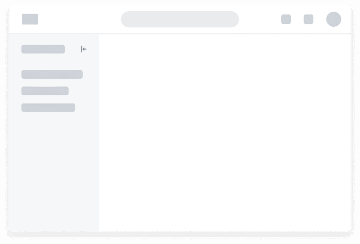
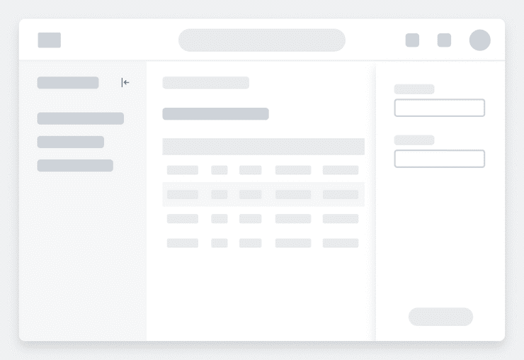
Side Panels are containers that anchor to the left or right side of the screen.
Anatomy
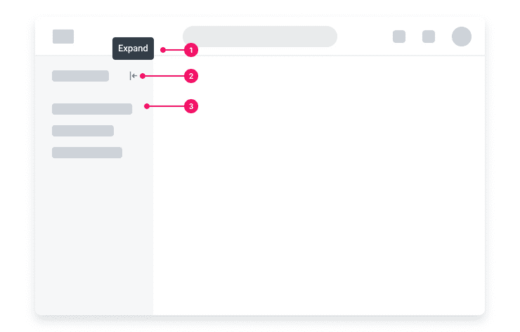
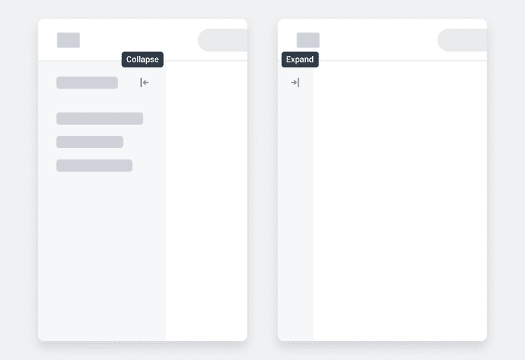
- Tooltip (Required if using Expand/Collapse Button): Tooltip used to provide additional visual affordance for the Expand/Collapse Button.
- Expand/Collapse Button (Optional):Icon only Tertiary Button variant used to open or close the Side Panel.
- Container: Rectangular container that houses the contents of the Side Panel. The container spans the full height of the viewport and are flush to the left or right edge of the screen.
Usage Guidance
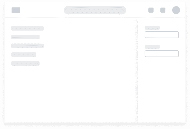
- Side Panels can either push and resize content as it expands within a page or float over page content. See the Expandable pattern (coming soon!) for more detailed information on horizontal animation.
- When the content of the Side Panel exceeds the height of the viewport, overflow behavior such as a scrollbar is introduced. Refer to the Overflow pattern for more information.
- Consider the behavior of Side Panels at different responsive breakpoints and in different use cases. In use cases where the Side Panel is used to edit content within the page, keeping the Side Panel open and resizing the page content may be ideal. For use cases where a Side Panel is not required to remain open, enabling a Side Panel to automatically collapse when it reaches smaller screen sizes will prevent the panel from taking up too much of the screen until the user wants to take action on it.
- When using the Expand/Collapse Button within the Side Panel, use a Tooltip to provide additional affordance that the icon is interactive and to improve accessibility for the Side Panel. When the Side Panel is expanded, tooltip text reads "Collapse" and collapsed, the tooltip reads "Expand."
When to Use
Although the elements within a Side Panel are highly configurable to support various use cases, they are commonly used in the following ways:
Local Page Navigation
- Provides users with a way to navigate within an area of your product.
- Typically tied to the main content region.
- Often collapsible but not closable, meaning the Panel remains on the page and cannot be dismissed.
Editing and Displaying Additional Information
- Ideal for editing specific content within the page or displaying additional information that supports the main content area.
- Can be temporary, meaning the Panel may disappear when the associated content on the main page is no longer in focus.
Panel Overlays
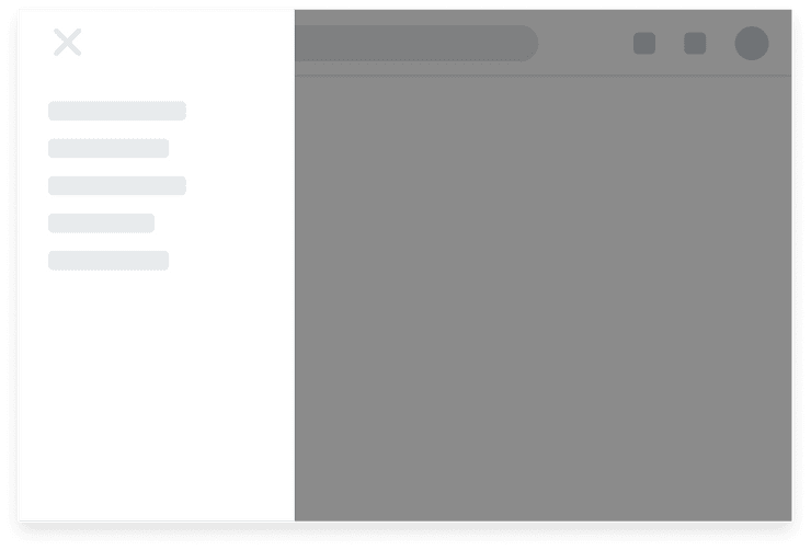
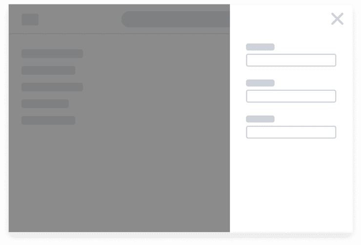
- When Panels open over an overlay, the user cannot interact with the main page. The overlay helps users focus attention on the contents of the Panel, making it ideal for higher-level navigation and editing or displaying additional information while minimizing distractions.
- A Side Panel that opens over an overlay has a close Button but not a collapse. Activating the Button closes the Panel and the Overlay so the user can return focus to the main page.
Do's and Don'ts
Caution
Consider screen real estate when multiple Side Panels are present within a page. When multiple Side Panels are open at the same time, it may be overwhelming to users as their page content shrinks.
Examples
Basic Example
SidePanel is composed of three parts:
- The panel container
- An accessible name (either on a visible element or hidden)
- A toggle button to control the expand / collapse states
Bidirectional support is built into SidePanel. As seen in the example below, CSS Flexbox flips the
page layout and the panel's contents. SidePanel also has logic to flip the position and direction
of the ToggleButton as well as the direction of the expand / collapse animation. If you're using
CSS Flexbox for layouts and using the provided components, you shouldn't have to provide any custom
logic or styling for bidirecitonal support.
Tasks Panel
Toggle the content direction
Hidden Name
SidePanel should always have an accessible label. Often this is the heading element with an id
attribute. However, as seen in the example below, you can apply a hidden attribute to your label
if you do not want it to be visible.
Alternate Variant
SidePanel has one variant, alternate, which you can supply as a top-level prop. Default depth of
alternate variant is 5, if alternate SidePanel has an overlay behavior the depth 6 should be
used (this case is covered in the Examples section).
Alternate Panel
Toggle the content direction
External Control
Sometimes you'll want to control SidePanel's' expand / collapse behavior from outside the
component. In that case, you can use the controlProps supplied by the useSidePanel hook.
Control the panel externally
Right Origin
By default, SidePanel uses a left origin. This sets the ToggleButton's position and direction
as well as the direction of the animation. But you can set SidePanel's origin to "right" to flip
these. As with the left-origin panel, all right-origin styles have bidirecitonal support.
Toggle the content direction
Tasks Panel
Always Open
If you do not need SidePanel's' expand / collapse behavior, you can simply omit the controlProps
and ToggleButton.
Tasks Panel
The majority of SidePanel's logic and funcitonality lives in this container component. Most of
this functionality has been described in the examples above, but there a couple specific callbacks
worth mentioning here.
onExpandedChange
The onExpandedChange callback is called when the boolean expanded state is updated. This is a
handy way to hook into these updates to trigger side-effects. Below is an example:
Side panel is expanded.
onStateTransition
While onExpandedChange works well for discrete boolean state changes, there may be occasions where
you also need transition states. In these situations, onStateTransition is a better fit. This
callback it called on all state transitions and returns the current transtion state. This can be one
of four SidePanelTransitionStates, expanding, expanded, collapsing, and collapsed. Below
is an example:
Side panel is expanded.
Component API
SidePanel
Props
Props extend from section. Changing the as prop will change the element interface.
| Name | Type | Description | Default |
|---|---|---|---|
collapsedWidth | number | string | The width of the component (in | 64 |
expanded | boolean | If true, sets the expanded state of the side panel | true |
expandedWidth | number | string | The width of the component (in | 320 |
origin | 'left' | 'right' | Which side the side panel is meant to originate from. | 'left' |
onExpandedChange | (expanded: boolean) => void | The function called when the side panel's | |
onStateTransition | (state: ) => void | The function called when the side panel is transitioning between states.
Use this to track when the side panel is animating between | |
variant | | The style variant of the side panel. 'standard' is with a | 'standard' |
touched | boolean | This is set by the useSidePanel hook and prevents unintended keyframe animations | |
children | ReactNode | ||
onAnimationStart | <> | ||
onAnimationEnd | <> | ||
as | React.ElementType | Optional override of the default element used by the component. Any valid tag or Component. If you provided a Component, this component should forward the ref using Note: Not all elements make sense and some elements may cause accessibility issues. Change this value with care. | section |
ref | React.Ref<R = section> | Optional ref. If the component represents an element, this ref will be a reference to the real DOM element of the component. If |
SidePanel.ToggleButton
SidePanel.ToggleButton is a control that is meant to toggle between expanded = true and
expanded = false states. It must be used within the SidePanel component as a child. Use
in conjunction with useSidePanel's controlProps, otherwise it does not come with explicit
onClick handlers.
For accessibility purposes, it must be the first focusable element. We recommend that you
keep it as the first child of SidePanel
Layout Component
SidePanel.ToggleButton supports all props from thelayout component.
Props
Props extend from button. Changing the as prop will change the element interface.
| Name | Type | Description | Default |
|---|---|---|---|
tooltipTextExpand | string | The tooltip text to expand the side panel | 'Expand' |
tooltipTextCollapse | string | The tooltip text to collapse the side panel | 'Collapse' |
variant | 'inverse' | undefined | The variant of the TertiaryButton. | |
size | | There are four button sizes: | |
iconPosition | | Button icon positions can either be | |
icon | | The icon of the TertiaryButton. | |
shouldMirrorIcon | boolean | If set to | |
allCaps | boolean | If set to | |
children | ReactNode | ||
isThemeable | boolean | If set to | |
theme | | ||
fill | | The fill color of the SystemIcon. This overrides | |
color | | The color of the SystemIcon. This defines | |
styles | | ||
shouldMirror | boolean | If set to | false |
background | | The background color of the SystemIcon. | |
accent | | The accent color of the SystemIcon. This overrides | |
accentHover | | The accent color of the SystemIcon on hover. This overrides | |
backgroundHover | | The background color of the SystemIcon on hover. | |
colorHover | | The hover color of the SystemIcon. This defines | |
fillHover | | The fill color of the SystemIcon on hover. This overrides | |
colors | | Override default colors of a button. The default will depend on the button type | |
fillIcon | boolean | Whether the icon should received filled (colored background layer) or regular styles.
Corresponds to | |
grow | boolean | True if the component should grow to its container's width. False otherwise. | |
as | React.ElementType | Optional override of the default element used by the component. Any valid tag or Component. If you provided a Component, this component should forward the ref using Note: Not all elements make sense and some elements may cause accessibility issues. Change this value with care. | button |
ref | React.Ref<R = button> | Optional ref. If the component represents an element, this ref will be a reference to the real DOM element of the component. If |
Hooks
useSidePanel
useSidePanel
This hook manages the state and aria- attributes for the SidePanel. It takes an optional
configuration object:
import {useSidePanel} from '@workday/canvas-kit-preview-react/side-panel';const {expanded, setExpanded, panelProps, labelProps, controlProps} = useSidePanel({initialExpanded: false,panelId: 'custom-panel-id',labelId: 'custom-label-id',});
(config: ) => {
expanded: boolean;
setExpanded: (newExpandedState: boolean) => void;
panelProps: ;
labelProps: ;
controlProps: ;
}Specifications
| Given | When | Then |
|---|---|---|
| given the "Default" story is rendered |
| |
| given the "Default" story is rendered |
| |
| given the "Default" story is rendered |
| |
| given the "Default" story is rendered |
| |
| given the "Default" story is rendered |
| |
| given the "Default" story is rendered |
|
|
| given the "AsAside" story is rendered |
| |
| given the "AsAside" story is rendered |
| |
| given the "AsAside" story is rendered |
| |
| given the "AsAside" story is rendered |
| |
| given the "AsAside" story is rendered |
| |
| given the "AsAside" story is rendered |
|
|
| given the "AsDiv" story is rendered |
| |
| given the "AsDiv" story is rendered |
| |
| given the "AsDiv" story is rendered |
| |
| given the "AsDiv" story is rendered |
| |
| given the "AsDiv" story is rendered |
| |
| given the "AsDiv" story is rendered |
|
|
| given the 'first focusable' story is rendered |
|
|
Accessibility Guidelines
- Each Panel requires a unique, human-readable accessible name to allow a screen reader user to perceive and understand how the Panel sits within the context of your page.
- Consider using visually hidden live region announcements to help a screen reader user understand if the Panel is expanded or collapsed when the toggle control is pressed.
- Supplement interactive non-text based icons with custom tooltips to reveal their labels both on mouse hover and keyboard focus.
- All text content must have a minimum contrast ratio of 4.5:1 with its background colour.
- Important non-text content (including individual states) must have a minimum contrast ratio of 3:1 with their adjacent background.
Can't Find What You Need?
Check out our FAQ section which may help you find the information you're looking for.
FAQ Section