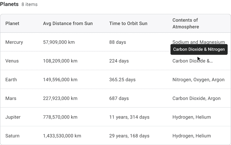
Table
Tables are an efficient way of displaying sets of repeating data with the same structure.
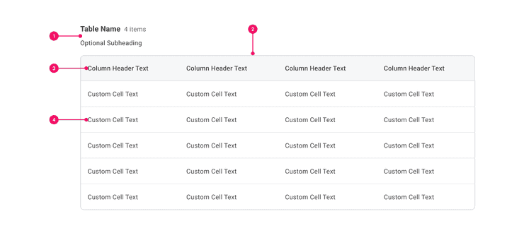
Anatomy - Tables
- Table Header (Optional): May consist of a header, result count, optional subheading, or any custom configuration of text.
- Table Outline (Optional): A border is used by default, but may be omitted for a full page table or in cases where a table is the sole element on a page.
- Column Header: Include just column labels by default, but icon actions for actions such as sort and filter may be added. Note that this functionality will be a custom add for developers.
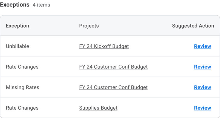
- Cell: May consist of text, icons, status indicators, buttons, data types, or other custom content. Text overflows by default, but teams may elect to apply truncation with a tooltip.
Usage Guidance
Data Tables are intended to display data that can be easily scanned and compared.
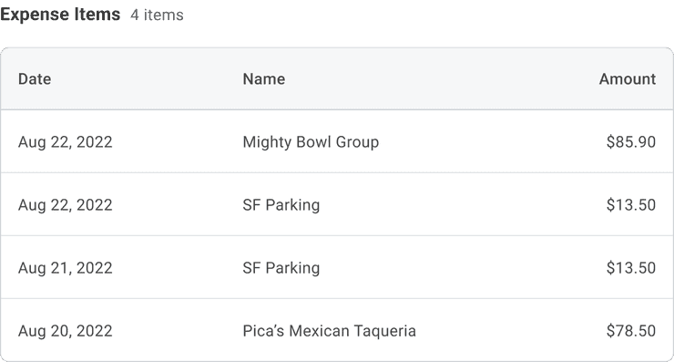
- Conceptually, each row in a Table represents an item, and each cell of that row is an attribute of that item.
- This means that all the cells in a particular column will be the same data type such as dates, numerals, text, etc.
- Ideally, there should be one value per cell. Field sets are discouraged.
- Nested Tables are highly discouraged.
When to Use
Use tables to allow users to:
- Easily scan and compare data
- View and edit data
- Manipulate and navigate through a large amount of data
- Preview data
When to Use Something Else
Consider another component when:
- You only have a small data set.
- A more detailed amount of information needs to be displayed by default.
- There is more than one piece of information within a cell.
Dos and Don'ts
Do
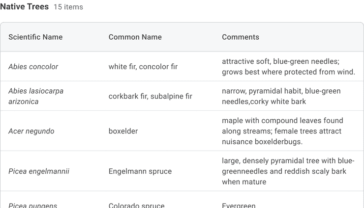
Allow cell text to wrap where possible, giving users access to the full contents of the cell by default.
Examples
Basic Example
Users may not want to use a caption so they can import Heading or
Text instead. This will give the user more flexibility around the
customization of the title/heading of their table.
Pizza Toppings
| Toppings | Amount |
|---|---|
| Pepperoni | 2.5 oz |
| Mozzarella | 5 oz |
| Basil | 10 Leaves |
Right to Left
Table supports right-to-left languages when specified in the CanvasProvider theme.
| מַשׁקֶה | גודל |
|---|---|
| אספרסו | 1 גר |
| מקיאטו | 2 גרם אספרסו |
| גזירה | 2 גרם אספרסו, 1 גרם חלב מוקצף |
Example with Caption
Users are free to use a caption instead of a heading. A caption is not required but it is good
for
accessibility
purposes.
| Drink | Size |
|---|---|
| Espresso | 1 oz |
| Macchiato | 2 oz Espresso |
| Cortado | 2 oz Espresso, 1 oz Foamed Milk |
| Cappuccino | 2 oz Espresso, 2 oz Foamed Milk, 2 oz Steamed Milk |
Fixed Column
Users may add styles to the Table.Header to render a fixed column. The example below assigns a
width to the Table to guarantee the fixed column is triggered, but you are free to omit the
width if you would only like the fixed column to be triggered if necessary.
Performance Car Specs
| Make | Model | Year | Price | Engine | Transmission | Horsepower | Torque | Curb Weight |
|---|---|---|---|---|---|---|---|---|
| Porsche | 992 911 GT3 | 2022 | Starts at $160,000 | 4.0L Flat 6 | PDK or 7-Speed Manual | 502hp | 346 lb-ft | 3,164 lbs |
| BMW | M5 Competition | 2018 | Starts at $105,000 | Twin-Turbo 4.4L V8 | Automatic | 627hp | 553 lb-ft | 4,345 lbs |
| Alfa Romeo | 1750 GTV | 1970 | $30,000 - $55,000 | 1.75L Inline 4 | Manual | 122hp | 137 lb-ft | 2,140 lbs |
| Lotus | Emira | 2023 | Starts at $78,000 | Supercharged 3.5L V6 | Automatic or 6-Speed Manual | 400hp | 317 lb-ft | 3520 lbs |
| Toyota | Supra | 1998 | $40,000 - $80,000 | 3.0L Inline 6 | Automatic or 6-Speed Manual | 320hp | 315 lb-ft | 3,599 lbs |
| Nissan | Skyline GT-R | 1994 | $45,000 - $90,000 | 2.6L Twin-Turbo Inline 6 | 5-Speed Manual | 276hp | 260 lb-ft | 3,153 lbs |
Advanced
You can also find several advanced Table examples in our Storybook Examples section.
Custom Styles
Table and its subcomponents support custom styling via the cs prop. For more information, check
our
"How To Customize Styles".
Component API
Table
Table is a simple styled compound component that renders a table element. It is used to present information in a two-dimensional table comprised of rows and columns of cells containing data.
import {Table} from '@workday/canvas-kit-react/table';export default function App() {return (<Table><Table.Caption>Table Caption</Table.Caption><Table.Head><Table.Row><Table.Header>Table Header</Table.Header><Table.Header>Table Header</Table.Header></Table.Row></Table.Head><Table.Body><Table.Row><Table.Header>Table Header</Table.Header><Table.Header>Table Header</Table.Header></Table.Row><Table.Row><Table.Header>Table Header</Table.Header><Table.Cell>Table Data Cell</Table.Cell></Table.Row><Table.Row><Table.Header>Table Header</Table.Header><Table.Cell>Table Data Cell</Table.Cell></Table.Row></Table.Body><Table.Footer><Table.Row><Table.Header>Table Header</Table.Header><Table.Cell>Table Data Cell</Table.Cell></Table.Row></Table.Footer></Table>);}
Layout Component
Table supports all props from thelayout component.
Props
Props extend from table. Changing the as prop will change the element interface.
| Name | Type | Description | Default |
|---|---|---|---|
cs | | The
| |
children | ReactNode | ||
as | React.ElementType | Optional override of the default element used by the component. Any valid tag or Component. If you provided a Component, this component should forward the ref using Note: Not all elements make sense and some elements may cause accessibility issues. Change this value with care. | table |
ref | React.Ref<R = table> | Optional ref. If the component represents an element, this ref will be a reference to the real DOM element of the component. If |
Table.Caption
Table.Caption renders a caption element.
import {Table} from '@workday/canvas-kit-react/table';export default function App() {return (<Table><Table.Caption>Table Caption</Table.Caption><Table.Body><Table.Row><Table.Header>Table Header</Table.Header><Table.Cell>Table Cell</Table.Cell></Table.Row></Table.Body></Table>);}
Layout Component
Table.Caption supports all props from thelayout component.
Props
Props extend from caption. Changing the as prop will change the element interface.
| Name | Type | Description | Default |
|---|---|---|---|
cs | | The
| |
children | ReactNode | ||
as | React.ElementType | Optional override of the default element used by the component. Any valid tag or Component. If you provided a Component, this component should forward the ref using Note: Not all elements make sense and some elements may cause accessibility issues. Change this value with care. | caption |
ref | React.Ref<R = caption> | Optional ref. If the component represents an element, this ref will be a reference to the real DOM element of the component. If |
Table.Head
Table.Head renders a thead element.
import {Table} from '@workday/canvas-kit-react/table';export default function App() {return (<Table><Table.Head><Table.Row><Table.Header>Table Header</Table.Header><Table.Cell>Table Cell</Table.Cell></Table.Row></Table.Head></Table>);}
Layout Component
Table.Head supports all props from thelayout component.
Props
Props extend from thead. Changing the as prop will change the element interface.
| Name | Type | Description | Default |
|---|---|---|---|
cs | | The
| |
children | ReactNode | ||
as | React.ElementType | Optional override of the default element used by the component. Any valid tag or Component. If you provided a Component, this component should forward the ref using Note: Not all elements make sense and some elements may cause accessibility issues. Change this value with care. | thead |
ref | React.Ref<R = thead> | Optional ref. If the component represents an element, this ref will be a reference to the real DOM element of the component. If |
Table.Body
Table.Body renders a tbody element.
import {Table} from '@workday/canvas-kit-react/table';export default function App() {return (<Table><Table.Body><Table.Row><Table.Header>Table Header</Table.Header><Table.Cell>Table Cell</Table.Cell></Table.Row></Table.Body></Table>);}
Layout Component
Table.Body supports all props from thelayout component.
Props
Props extend from tbody. Changing the as prop will change the element interface.
| Name | Type | Description | Default |
|---|---|---|---|
cs | | The
| |
children | ReactNode | ||
as | React.ElementType | Optional override of the default element used by the component. Any valid tag or Component. If you provided a Component, this component should forward the ref using Note: Not all elements make sense and some elements may cause accessibility issues. Change this value with care. | tbody |
ref | React.Ref<R = tbody> | Optional ref. If the component represents an element, this ref will be a reference to the real DOM element of the component. If |
Table.Row
Table.Row renders a tr element.
Note: Table.Row is built on Grid. It will look for
how many children are there and if those children are valid React Elements. This will adjust the
amount of columns automatically using the gridTemplateColumns style prop and the width of the
columns is also set using a minmax function in the gridTemplateColumns style prop. If a user
would like to adjust this, it can be overwritten on Table.Row. See the example below for how to
overwrite gridTemplateColumns.
import {Table} from '@workday/canvas-kit-react/table';export default function App() {return (<Table><Table.Head><Table.Row gridTemplateColumns="repeat(4, minmax(100px, 1fr))"><Table.Header>Table Header</Table.Header><Table.Cell>Table Cell</Table.Cell></Table.Row></Table.Head></Table>);}
Layout Component
Table.Row supports all props from thelayout component.
Props
Props extend from tr. Changing the as prop will change the element interface.
| Name | Type | Description | Default |
|---|---|---|---|
cs | | The
| |
children | ReactNode | ||
as | React.ElementType | Optional override of the default element used by the component. Any valid tag or Component. If you provided a Component, this component should forward the ref using Note: Not all elements make sense and some elements may cause accessibility issues. Change this value with care. | tr |
ref | React.Ref<R = tr> | Optional ref. If the component represents an element, this ref will be a reference to the real DOM element of the component. If |
Table.Header
Table.Header renders a th element.
import {Table} from '@workday/canvas-kit-react/table';export default function App() {return (<Table><Table.Head><Table.Row><Table.Header>Table Header</Table.Header><Table.Cell>Table Cell</Table.Cell></Table.Row></Table.Head></Table>);}
Layout Component
Table.Header supports all props from thelayout component.
Props
Props extend from th. Changing the as prop will change the element interface.
| Name | Type | Description | Default |
|---|---|---|---|
cs | | The
| |
children | ReactNode | ||
as | React.ElementType | Optional override of the default element used by the component. Any valid tag or Component. If you provided a Component, this component should forward the ref using Note: Not all elements make sense and some elements may cause accessibility issues. Change this value with care. | th |
ref | React.Ref<R = th> | Optional ref. If the component represents an element, this ref will be a reference to the real DOM element of the component. If |
Table.Cell
Table.Cell renders a td element.
import {Table} from '@workday/canvas-kit-react/table';export default function App() {return (<Table><Table.Body><Table.Row><Table.Header>Table Header</Table.Header><Table.Cell>Table Cell</Table.Cell></Table.Row></Table.Body></Table>);}
Layout Component
Table.Cell supports all props from thelayout component.
Props
Props extend from td. Changing the as prop will change the element interface.
| Name | Type | Description | Default |
|---|---|---|---|
cs | | The
| |
children | ReactNode | ||
as | React.ElementType | Optional override of the default element used by the component. Any valid tag or Component. If you provided a Component, this component should forward the ref using Note: Not all elements make sense and some elements may cause accessibility issues. Change this value with care. | td |
ref | React.Ref<R = td> | Optional ref. If the component represents an element, this ref will be a reference to the real DOM element of the component. If |
Table.Footer
Table.Footer renders a tfoot element.
import {Table} from '@workday/canvas-kit-react/table';export default function App() {return (<Table><Table.Footer><Table.Row><Table.Header>Table Header</Table.Header><Table.Cell>Table Cell</Table.Cell></Table.Row></Table.Footer></Table>);}
Layout Component
Table.Footer supports all props from thelayout component.
Props
Props extend from tfoot. Changing the as prop will change the element interface.
| Name | Type | Description | Default |
|---|---|---|---|
cs | | The
| |
children | ReactNode | ||
as | React.ElementType | Optional override of the default element used by the component. Any valid tag or Component. If you provided a Component, this component should forward the ref using Note: Not all elements make sense and some elements may cause accessibility issues. Change this value with care. | tfoot |
ref | React.Ref<R = tfoot> | Optional ref. If the component represents an element, this ref will be a reference to the real DOM element of the component. If |
Accessibility Guidelines
How Tables Impact The Accessible Experience
Whether you are comparing products or understanding a schedule, arranging information into rows and
columns helps communicate relationships in the content. When users are unable to perceive the visual
layout of the content, screen readers are able to derive context like the number of rows in a table
from the number of <tr> elements. Similarly, the number of columns is based on the <th> and
<td> elements used in a row.
Semantic, and correct, HTML markup is critical to providing access to tabular content. On the other hand, table markup used strictly for the purposes of content layout may be invisible to sighted users, but screen readers will continue to express the content in terms of rows and columns. This dated practice can make it much more difficult for non-visual users to understand simple content on a page.
Keyboard Interaction
Any interactive elements in the Table must have a focus indicator that is highly visible against the background and against the non-focused state. Refer to Accessible Colors for more information.
Tables must support the following keyboard interactions: Tab: Focuses interactive elements
included inside the table cells (e.g. buttons, links, inputs, selects, etc.) Left Arrow or
Right Arrow:Scroll the table with fixed columns
NOTE: The keyboard should only be allowed to focus on the interactive components inside of a table. Allowing the keyboard to focus on the individual rows of the table is not recommended.
Screen Reader Interaction
Tables must communicate the following to users:
- The purpose of the table
- The correct number of rows and columns in each table
- Automatically describe the column headers when reading content from any row in the table
- Automatically describe row headers when reading content from any column in the table (if applicable)
Design Annotations Needed
- Specify the column header for every column
- Specify the row headers, if applicable
- Specify the caption of the table
Implementation Markup Needed
- Do not use any table markup strictly for layout purposes.
- Set the
scopeattribute to”col”on the column header<th>elements. - Set the
scopeattribute to”row”on the row header<th>elements, if applicable. - When a Table
<caption>is not used, set anaria-labelledbyattribute on the<table>element referencing the uniqueidof the table’s heading. - When a table can scroll horizontally with fixed columns, set
tabindex=”0”on the<table>element. - [Included in component] The
<caption>element must be used to briefly describe the purpose of a table.
Content Guidelines
- When writing titles, column headers, and other text for Tables, refer to the Tables section of the Content Style Guide.
Mobile
| Platform | Availability |
|---|---|
| iOS | Yes |
| Android | Yes |
Guidelines
Due to screen size limitations, the display of Tables on mobile is different from the desktop display. Rather than displaying inline on the page, there is a tile preview which the user can tap to display a full-page view-only Table. To edit the data in this Table, the user taps the row they wish to edit and an editable form of that row is shown.
Please note: Tables 2.0 is not currently available for Mobile applications.
Can't Find What You Need?
Check out our FAQ section which may help you find the information you're looking for.
FAQ Section