Accessible Color
Color communicates information; it helps users understand the purpose of controls and read information on a page. When color is used effectively, it enhances pages and clearly conveys important details.
Designing with Color
Using color in a manner that allows all users to understand designs is crucial to creating an inclusive design. Choose colors that allow optimal usability within your application. Color should be used to enhance understanding rather than as the primary means to communicate information. Consider the following when designing with color:
- Using color as the sole means of communicating information is not as clear as using multiple methods of communicating information.
- Different user types may not be able to recognize information that is only conveyed using a single sensory characteristic such as color.
Contrast Ratios
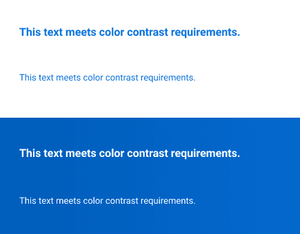
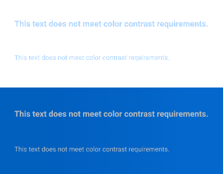
All text, images of text, and icons should provide sufficient contrast so that users are able to navigate and interact with your interface easily. Contrast is displayed as a ratio that ranges from 1:1 to 21:1. The difference between the two numbers indicates how much relative luminance (the relative brightness of any point in a colorspace) there is between the foreground and background colors. Contrast ratio requirements ensure that foreground content can easily be seen in front of a background color.
Color-contrast ratios will vary depending on font size and weight, and will generally be lower as text gets larger because the strokes on larger letters are wider and easier to read at a lower-contrast ratio.
Ensuring that contrast ratios are properly met will allow all users to read and understand content. These W3C guidelines apply to contrast ratios:
- Text that is 14 pt or below must meet a 4.5:1 contrast ratio.
- Text that is 14 pt and bold or larger than 18 pt must meet a 3:1 contrast ratio.
- Contrast ratios also apply to text, non-text content, and images of text.
- Non-text content must meet a 3:1 contrast ratio.
Do's and Don'ts
Do
- Use colors that meet contrast ratios for all text, non-text content, and image of text.
- Follow color guidelines laid out in Canvas.
Don’t
- Use color as the sole means of communicating information.
- Alter colors of logotypes; they are not required to meet color contrast requirements.
Can't Find What You Need?
Check out our FAQ section which may help you find the information you're looking for.
FAQ Section
