Type
Typography is at the core of our interface. With it, we create clear hierarchies that guide users through our products.
yarn add @workday/canvas-kit-reactyarn add @workday/canvas-kit-reactUsage Guidance
The Canvas Type System contains a range of contrasting sizes built upon the foundational principles
of typographic design. The system is responsive, built using rem values with the base font size set
to 16px (1rem), aligning to the base value for Canvas Spacing. It’s flexible,
and configurable, purpose built for Workdays diverse and growing product suite. In this section you
will find the rationale behind the Canvas type system, and what is available to use.
Typeface
The Canvas Type system uses Roboto as its primary typeface, a typeface is a collection of fonts such as ‘Roboto Bold’ and ‘Roboto Bold Italic’. Canvas utilizes Roboto's monospace counterpart, Roboto Mono for specific use cases like tabular figures.
To use the Canvas Kit font on web
install and import the @workday/canvas-kit-react-fonts module.
Note: This module sources fonts from the Workday CDN.
Font Stack
The font stack contains a number of similar typefaces to support a series of fallbacks for circumstances when Roboto cannot be loaded on a user's device.
Sans-serif font stack
'Roboto', 'Helvetica Neue', 'Helvetica', Arial, sans-serifMono font stack
'Roboto Mono', 'Courier New', 'Courier', monospaceType Styles
The Canvas type system contains a total of 12 type styles to create robust typographic hierarchies.
They are informed by the Canvas Type Scale to build a predictable and rational system. Styles are
categorized by levels and sizes, there are 4 type levels, each level is coupled with 3 sizes. Each
size applies fontFamily, fontSize, fontWeight, lineHeight, letterSpacing, and color
styles for you, so you can create consistent type quickly and easily. Type styles are highly
composable and allow for easy modifications to be made such as changes to weight, color, and the
addition of variants.
| Type Level | Type Size | Visual |
|---|---|---|
| Subtext | Small | The quick brown fox jumps over the lazy dog font-size: 0.625rem (10px) | line-height: 16px | font-weight: 400 | letter-spacing: 0.4px |
| Subtext | Medium | The quick brown fox jumps over the lazy dog font-size: 0.75rem (12px) | line-height: 16px | font-weight: 400 | letter-spacing: 0.32px |
| Subtext | Large | The quick brown fox jumps over the lazy dog font-size: 0.875rem (14px) | line-height: 20px | font-weight: 400 | letter-spacing: 0.24px |
| Body | Small | The quick brown fox jumps over the lazy dog font-size: 1rem (16px) | line-height: 24px | font-weight: 400 | letter-spacing: 0.16px |
| Body | Medium | The quick brown fox jumps over the lazy dog font-size: 1.125rem (18px) | line-height: 28px | font-weight: 400 |
| Body | Large | The quick brown fox jumps over the lazy dog font-size: 1.25rem (20px) | line-height: 28px | font-weight: 400 |
| Heading | Small | The quick brown fox jumps over the lazy dog font-size: 1.5rem (24px) | line-height: 32px | font-weight: 700 |
| Heading | Medium | The quick brown fox jumps over the lazy dog font-size: 1.75rem (28px) | line-height: 36px | font-weight: 700 |
| Heading | Large | The quick brown fox jumps over the lazy dog font-size: 2rem (32px) | line-height: 40px | font-weight: 700 |
| Title | Small | The quick brown fox jumps over the lazy dog font-size: 2.5rem (40px) | line-height: 48px | font-weight: 700 |
| Title | Medium | The quick brown fox jumps over the lazy dog font-size: 3rem (48px) | line-height: 56px | font-weight: 700 |
| Title | Large | The quick brown fox jumps over the lazy dog font-size: 3.5rem (56px) | line-height: 64px | font-weight: 700 |
Web Example
import {type} from '@workday/canvas-kit-react/tokens';const ContentSection = () => (<section><h2 css={type.levels.heading.large}>Section Heading</h2><p css={type.levels.subtext.large}>This is section body text.</p></section>);
Typescale
The Canvas type scale is divisible by 2, this provides a wide range of type sizes to choose from. The divisible scale provides a logical order of predictable sizes. The scale is informed by Canvas spacing principles to ensure consistent spacing is maintained in Workday's UI when other elements are included alongside type.
Canvas Kit v5 introduced rem units (instead of px) to our type tokens. This update follows the
guidance from the WCAG spec and provides better support
for users who change their browser's default font size. If you'd like to learn more about rem and
relative units, you can review this
documentation on CSS values and units.
Note: We are using
16pxas our base font-size for these values. This is a browser standard and also fairly common across Workday. However, if your body text is set to a value other than16px, you will need to adjust that value for text to render properly.
Baseline Grid
A baseline grid is the foundation that type rests on. It is a series of rows that are used to create consistent vertical spacing with text. The Canvas Baseline grid of 4px is also informed by Canvas spacing principles, allowing uniform spacing to be maintained across Workday's UI.
Line Height
Line height controls the amount of space between lines of text, line height is used to scale text proportionally and is directly informed by the Canvas baseline grid to create uniform line heights across type styles.
Font Weight
Weight can add additional emphasis to typographic hierarchies, using weights can highlight the importance of the content displayed on a device. Canvas recommends the use of Bold, Medium and Regular weights to support the majority of use cases encountered. These can be used on any level of the type hierarchy. Light weights are reserved for large sized text, the lower contrast of light weights makes it difficult to read at small sizes.
- Light - 300
- Regular - 400
- Medium - 500
- Bold - 700
Web Example
import {type} from '@workday/canvas-kit-react/tokens';const BoldLabel = props => (<label css={type.properties.fontWeights.bold} {...props}>Example Bold Label</label>);
Type Color
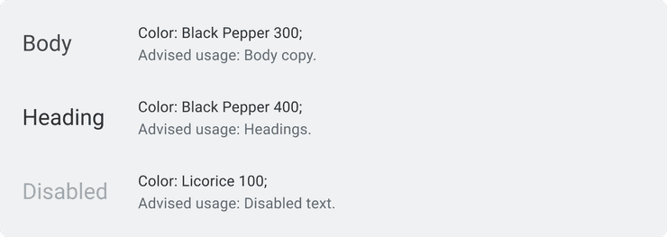
Using type colors applies comfortable contrast ratios to type and makes the content presented to the reader much easier to consume. Using the type colors provided by Canvas will create texture in your hierarchies, building visual interest as well as indicating the function of typographic elements.
Variants
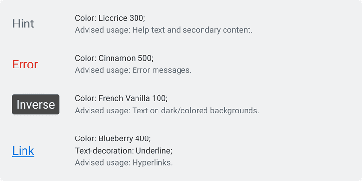
Variants allow Canvas type styles to be modified beyond what is available by default, variants allow you to build detail on top of your typographic hierarchies that can aid your readers' understanding of the information displayed in your products.
| Name | Description |
|---|---|
error | Used for making errors more visible |
hint | Used for help text and secondary content |
inverse | Used for any text on a dark or colored background |
Web Example
import {type} from '@workday/canvas-kit-react/tokens';const HintText = (props) => (<label css={{ ...type.levels.subtext.medium, type.variants.hint }} {...props}>Example Hint Variant Label</label>);
Additional Considerations
For additional guidance when using All Caps, Hyperinks, and choosing appropriate Line Lengths in your products, please read the sections below.
All Caps
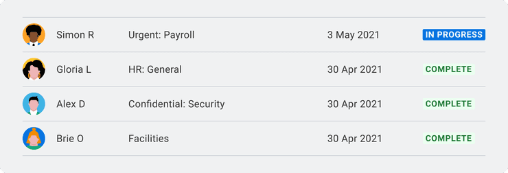
All Caps, or Uppercase characters can be difficult to read when frequently used on a page. All Caps can seem to shout at the reader when overused, but authoritative when used sparingly. A great example of All caps are Canvas’s Status Indicators, these small text based indicators pack a punch, while they are small, they stand out on a page in work to quickly inform the reader of an important status.
Hyperlinks
Hyperlinks are used to create shortcuts to other locations using the link variant, these should link to related information for the user to read if they wish. Hyperlink styles should be used sparingly as the high contrast style can become a burden to the reader if poorly implemented. Never embed a hyperlink into an entire paragraph of text, instead, embed a key word that relates to the information you wish to link off to.
Line Length
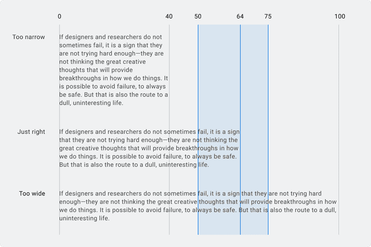
Line length can determine the readability of paragraphs, the recommended number of characters in a line of text should range from 45-75 characters per line. Canvas recommends 64 characters per line to produce comfortable paragraphs for optimal readability.
Web Examples
The type tokens are divided into three main parts:
levels(the type hierarchy)properties(fontFamilies,fontSizes, andfontWeights)variants(modifiers for type styles)
Each part serves its own purpose but is also designed to be combined with the others. Knowing how and when to combine tokens is key to getting the most out of them.
Properties
As previously mentioned, you'll most often you will want to reach for levels, but in some
situations you may only need to set one or two type values for styling. Type properties give you
an atomic-level of control when you want to explicitly set a particular value.
| Property | Description |
|---|---|
fontFamilies | Contains font-family tokens: default and monospace |
fontSizes | Contains font-size tokens: keys are in px, values are in rem |
fontWeights | Contains font-weight tokens: regular, medium, and bold |
Web Example
Here's an example using fontFamilies, fontSizes, and fontWeights.
Note:
fontSizeskeys are in pixel values as a convenient reference, but the values are the base-16 rem equivalent. E.g.fontSizes[12]returns0.75rem.
import {type} from '@workday/canvas-kit-react/tokens';const customTextStyles = {fontFamily: type.properties.fontFamilies.default,fontSize: type.properties.fontSizes[16],fontWeight: type.properties.fontWeights.medium,};const CustomText = () => (<p css={customTextStyles}>This is custom Roboto medium text using type properties.</p>);
Quick Reference
Here's a quick reference guide for the values contained in each property:
Font Families
| Name | Value |
|---|---|
default | "Roboto", "Helvetica Neue", "Helvetica", Arial, sans-serif |
monospace | "Roboto Mono", "Courier New", Courier, monospace |
Font Sizes
Name (px) | Value (rem) |
|---|---|
10 | '0.625rem' |
12 | '0.75rem' |
14 | '0.875rem' |
16 | '1rem' |
18 | '1.125rem' |
20 | '1.25rem' |
24 | '1.5rem' |
28 | '1.75rem' |
32 | '2rem' |
40 | '2.5rem' |
48 | '3rem' |
56 | '3.5rem' |
Creating Combinations
As previously mentioned, in most cases all you'll need will be the levels of the type hierarchy.
But these tokens can also be used to create style combinations when necessary. Below is a web
example:
import {type} from '@workday/canvas-kit-react/tokens';const listItemBaseStyles = {padding: 0,...type.levels.subtext.large,};interface InverseListItemProps {isActive?: boolean;}const InverseListItem = (props: InverseListItemProps) => {const listItemActiveStyles = props.isActive? {fontWeight: type.properties.fontWeight.medium,...type.variants.inverse,}: {};return <li css={{...listItemBaseStyles, ...listItemActiveStyles}}>First List Item</li>;};
Can't Find What You Need?
Check out our FAQ section which may help you find the information you're looking for.
FAQ Section


