Keyboard Focus Management
Many people browse the web using a mouse, but many people with disabilities often browse the web only using a keyboard. Keyboard navigation allows users who have physical impairments or who lack fine motor control to navigate and interact with web controls.
Why Add Keyboard Focus
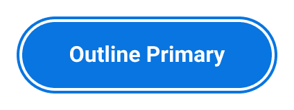
Users navigating an interface using a keyboard need ways to validate their shift from one section of a page to another. Adding the keyboard focus such as in the button example shown is a way these users can quickly and easily validate their navigation status.
 Large Primary Outline button before
receiving keyboard focus
 Large Primary Outline button after
receiving keyboard focus
Just like with a mouse, users interact with one object at a time. When a user interacts with an object, that object is said to receive focus, and focused elements should have visible focus indicators that inform users where keyboard focus is on the webpage.
How a user keyboard-navigates through each element in the Workday homepage
It is up to web developers and content creators to ensure that interactive elements are easily navigated by keyboard and that focus indicators have enough contrast on a page. Intuitive, logical, and consistent focus management ensures users can easily navigate by keyboard throughout your UI. Alternatively, ignoring focus management results in redundant, restrictive, or nonexistent navigation. Websites without keyboard support present a barrier to people with disabilities.
Create Excellent Navigation Experiences
Keyboard focus should visibly follow the shortest possible path while allowing the user to reach all functionality. Achieve this by ensuring that:
- Focus moves from where a user starts on a page to where the user ends on a page (left to right, top to bottom).
- All keyboard-navigable elements have distinct focus indicators that follow color contrast requirements.
- Focus doesn’t move away from components if users didn’t initiate the movement.
- Focus moves logically when a control is removed, usually to the closest actionable element.
- When keyboard focus moves, the movement appears visually through a focus indicator.
- When components that restrict focus (including dialogs, menus, popups, and lists) are closed, focus returns to their triggering elements.
- Components such as tab panels, menus, and lists utilize standard keyboard navigation patterns.
On Page Load
The integration of interaction patterns when a page loads critically affects user experience for keyboard navigation users. Keyboard-navigation users expect that, on page load, the keyboard focus is:
- Programmatically set prior to the page loading.
- Placed logically in a consistent manner (depending on the scenario).
Errors
Errors can disrupt user flow for any user, but they can be particularly disruptive for keyboard-navigation users. Blocks of content between the error and submission areas can prevent keyboard navigation users from efficiently submitting a form. Create more efficient form validation by ensuring that:
- After a user submits a form and receives an error notification, focus moves to the first form field that has an error.
- Key areas of the form, such as the submission button, are always keyboard-navigable.
Do's and Don'ts
Do
- Use distinct focus indicators that meet color contrast requirements.
- Consider navigation edge cases.
- Create logical navigation experiences, referencing standard navigation patterns.
Don’t
- Move focus without user input.
- Create new navigation patterns when standard patterns suffice.
Can't Find What You Need?
Check out our FAQ section which may help you find the information you're looking for.
FAQ Section