Depth
Throughout Canvas, depth plays an important role in our UI by mimicking real world principles of light and shadow to help establish hierarchy and bring attention to key areas of our product.
yarn add @workday/canvas-kit-reactyarn add @workday/canvas-kit-reactUsage Guidance
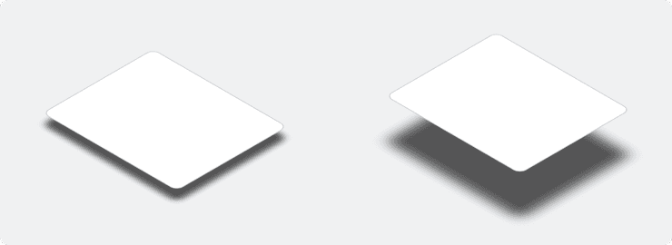
Depth helps the user understand the spatial relationship between objects by utilizing differences in shadows. The closer an object is to another surface the smaller and harder the shadow becomes. As that object moves away from the surface the shadow will grow and become softer. We can use this to our advantage by placing more critical or important objects closer to the user.
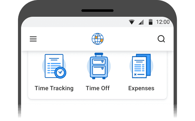
We also use depth in our UI to help guide and focus the user's eye on certain elements by adding contrast or definition with various shadows. An example of this would be when we add depth to certain temporary elements, like a menu.
Depth Values
Our depth styles utilize two different shadows to create a more realistic appearing shadow. A sharper and shorter shadow that is indicative of a strong direct light. And a second softer and longer shadow resembling reflected or ambient lighting.
Do You Really Need a Shadow?
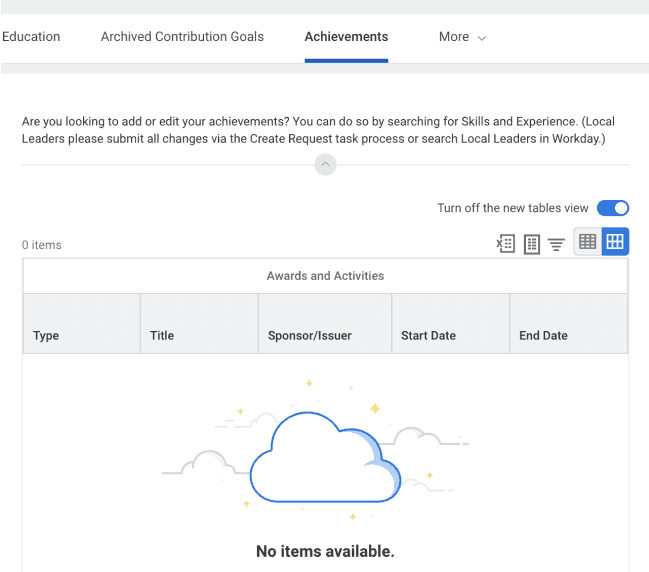
Not every piece of our UI needs to have depth. Depth should be used minimally and intentionally to help improve the experience. When used improperly, depth can lead to added visual noise and weight in the UI resulting in a crowded, ineffective, and confusing experience for our users. It is okay to use zero depth for most of our UI. If certain elements of an experience need increased definition there are alternative ways in achieving this through the use of color or borders. Typically we do not recommend combining these alternative methods with our defined depth values.
Recommended Usage
Choose from the depth tokens below to see their recommended usage.
Depth 0
Select drop-down
Objects resting on grey backgrounds
A stroke may be applied to create definition if depth is not necessary
Depth 1
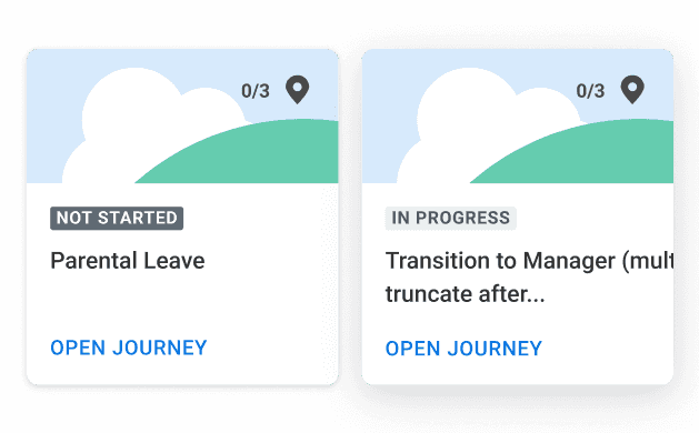
Card components
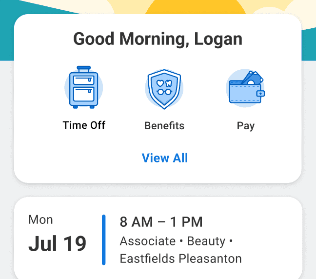
Depth 2
Top navigation
Bottom navigation

Depth 3
Floating Action Button (FAB)
Menus
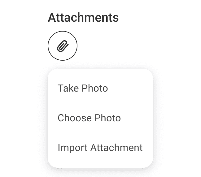
Depth 4
Bottom sheets
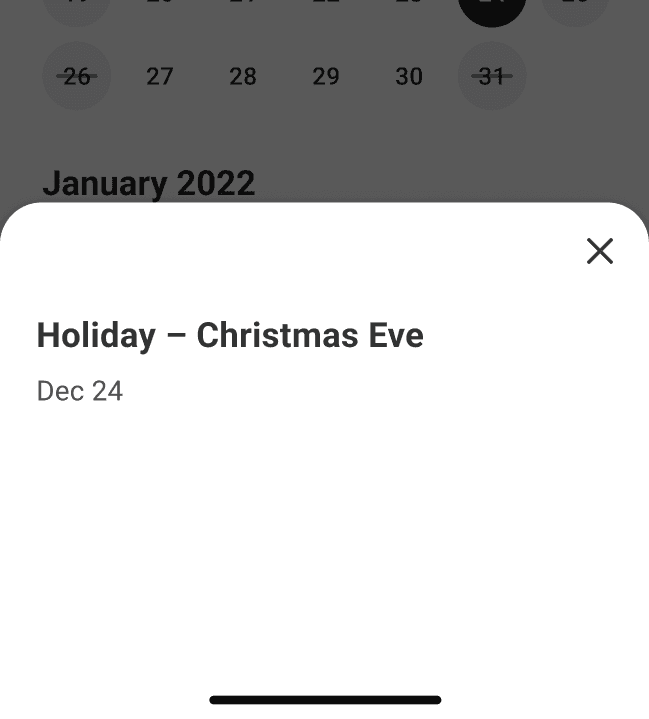
Depth 5
Banners
Snackbars
Toast Messages
Non modal Dialogs
Side Panels(when opacity overlay behaviour is not applied)
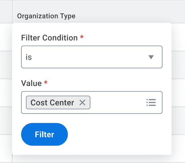
Depth 6
Modal Dialogs
Side Panels(when opacity overlay behaviour is applied)

| Depth Token | Shadow 1 | Shadow 2 |
|---|---|---|
| Depth 1 | x:0 y:1 Blur:4 Color:#1F262E Alpha 12 | x:0 y:1 Blur:8 Color:#1F262E Alpha 8 |
| Depth 2 | x:0 y:2 Blur:8 Color:#1F262E Alpha 12 | x:0 y:4 Blur:16 Color:#1F262E Alpha 8 |
| Depth 3 | x:0 y:3 Blur:12 Color:#1F262E Alpha 12 | x:0 y:6 Blur:24 Color:#1F262E Alpha 8 |
| Depth 4 | x:0 y:4 Blur:16 Color:#1F262E Alpha 12 | x:0 y:8 Blur:32 Color:#1F262E Alpha 8 |
| Depth 5 | x:0 y:5 Blur:20 Color:#1F262E Alpha 12 | x:0 y:10 Blur:40 Color:#1F262E Alpha 8 |
| Depth 6 | x:0 y:6 Blur:24 Color:#1F262E Alpha 12 | x:0 y:12 Blur:48 Color:#1F262E Alpha 8 |
Dos and Don'ts
Web Examples
import {depth} from '@workday/canvas-kit-react/tokens';depth.none;depth['2'];
iOS Examples
Coming soon!
Android Examples
Coming soon!
Accessibility Guidelines
Make sure tooltips, overlays, and modals are visually distinct from other content through supporting icons, color usage, appropriate depth usage, and other visual elements Make sure borders of tooltips, overlays, and modals meet 3:1 contrast with their backgrounds
Can't Find What You Need?
Check out our FAQ section which may help you find the information you're looking for.
FAQ Section