Errors and Alerts
Error and alert messages provide contextual and actionable feedback to help users move forward in their workflow.
Error or Alert?
Errors
Errors identify and explain critical information that users must address before proceeding. Error messages should provide details on how to resolve the issue when possible. As detailed in the Notifications article, error messages are often accompanied by a supplementary visual indicator in the color Cinnamon 500. Although color is a great visual indicator for users without disabilities, text should always be used to distinguish errors and alerts on a page.
Alerts
Alerts convey non-critical information that may help the user prevent a future error but don’t require attention or action for the user to move forward. Alert messages can give users a warning about the potential unknown or irreversible consequences of their actions before they commit them. Alert messages are often accompanied by a supplementary visual indicator in the color Cantaloupe 400.
When do Errors and Alerts Appear?
Form Validation
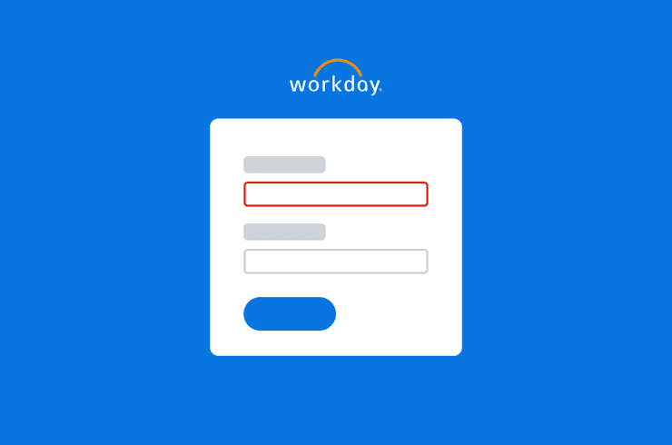
Users most commonly encounter errors and alerts when filling out forms. Forms can validate errors and alerts “onBlur” or “onSubmit”.
- onBlur error and alert validation occurs when a user shifts focus out of the input, such as by tabbing to another element or clicking out of the input. This immediate form of feedback allows users to address errors and alerts as they make their way through a form.
- onSubmit validations occur when the system detects an issue after the user tries to move forward in their workflow, by activating a button. When the button is activated, the system checks the entire page for errors or alerts. If errors and alerts are detected, the system applies error and alert styling to the elements associated with the issue. onClick error validation is preferred for accessibility.
Focus behavior differs between “onBlur” and “onSubmit” validations
- Do not shift focus if an error validates onBlur. Because these validations occur inline when a user changes focus by tabbing or clicking out of the input, intercepting the user’s navigation to bring the focus state back to the element containing the error or alert message results in a jarring and unexpected user experience and creates a keyboard trap for users who depend on the keyboard only to navigate. Keyboard traps prevent users from escaping the input until the error is corrected and are considered serious accessibility blockers.
- When errors and alerts appear on submit, move focus to the list of errors and alerts, such as to the Banner or Modal component.
System Detects an Error or Alert
Errors and alerts can also occur when the server is unable to retrieve information or fails to complete a request. The system then communicates that something went wrong and explains why the issue occurred, if possible.
Sometimes the error is unknown and no solution can be provided other than to try again later. These errors and alerts are commonly detected when the system fails to load data due to the user’s permissions, system performance issues, or poor network connection.
Message Hierarchy
Error and alert messages should be easy to locate and associate with their corresponding attribute. Specific visual treatments that accompany error and alert messages vary based on what the message is tied to.
Element-level
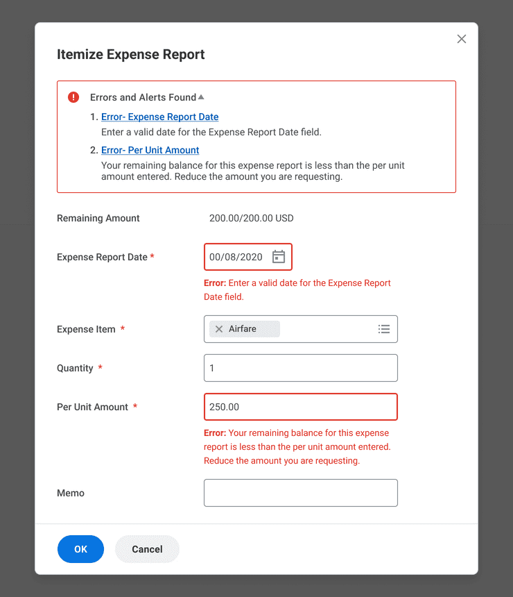
Errors and alerts that are associated to specific elements on the page use a combination of message and visual cues to help the user locate and address them. In the example above, element-level messages are prefixed by “Error” and “Alert” text labels. These labels make it easier for users to identify errors and alerts for low-vision and color-blind users.
Container-level
Certain containers provide additional, localized cues to help draw attention to errors and alerts that are easy to scroll past or hard to find. For example, Modal components display a collapsible list of errors and alerts at the top of the container. Activating these links brings keyboard focus to the corresponding error, allowing users to navigate to these issues quickly.
Page-level
Page-level errors and alerts display issues that aren’t tied to one specific element on a page.
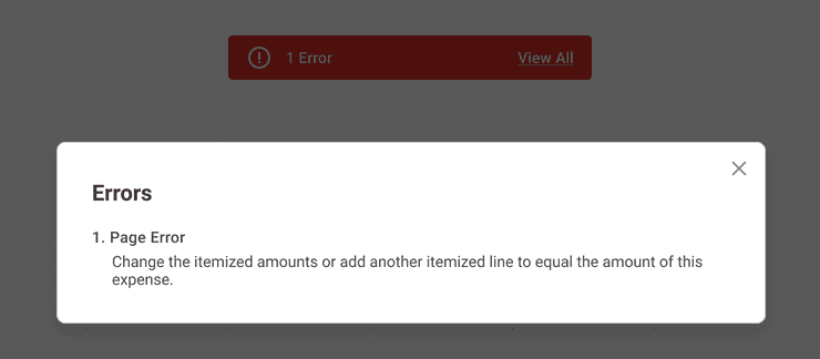
This could happen when the combined values of several fields together produce an error. In the example above, a Modal component appears when a user activates the Banner component positioned at the top of the page. The Modal communicates a page error has been detected because the items in the expense report do not equal to the total amount expensed.
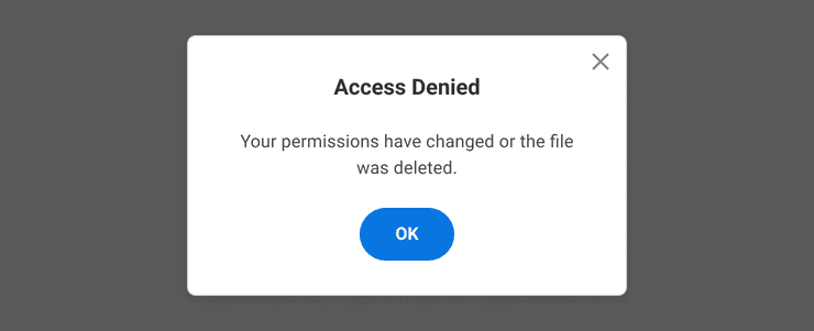
Page-level errors can also occur in response to security restrictions or when an object no longer exists. In the example above, a Modal component communicates to the user that access to a file has been denied because the file was either deleted or the user’s access is restricted.
Global
Global errors alert users when something affects the system at large. An example of a global error occurs when the server cannot retrieve information for a page due to an internet disruption. In this native mobile example, the user is shown a full-page error message telling the user that they are offline and instructs the user to refresh the page when a connection has been established.
Examples
Although some examples of error and alert messages are included here, please refer to the Error and Alert Messages section of the Content Style Guide to see more detailed information on how to write messages that are precise, constructive, and specific to the user’s context.
| What Went Wrong | When the Message Appears | UI Solution | Example Message |
|---|---|---|---|
| User enters a value in an input that doesn’t meet the form requirements. | Dynamic form validation: User shifts focus away from input | Banner: inline error message | Enter an End Date that is in the future. |
| User submits the form but has skipped over required fields. | Submit form validation: User activates action button to move forward in the process | Banner: inline error message | Enter values for the following fields: Expense Report; Expense Amount. |
| User itemizes an expense but the total amounts don’t add up. | Submit form validation: User activates action button to submit the form | Banner: page-level error message and inline error message, if possible | Your remaining balance for this expense report is less than the per unit amount entered. Reduce the amount you are requesting. |
| User tries to save a document with the same name as an existing document. | System detects an error | Modal: page-level error | There’s already a file named “Journey Maps”. Enter a new name for this file or replace the existing file. [Replace][cancel] |
| User tries to load a report but runs into a performance issue and the server is slow to load content. | System detects an error | Modal: page-level alert | Processing your request. You can keep working while this runs in the background, and we’ll notify you when the report is ready. [Notify Me Later][cancel] |
| Internet connection has been interrupted and cannot load the page. | System detects an error | Empty State: global error | You’re Offline Check your Wifi or data connection. [Refresh Page] |
Error Prevention
Aim to design an interface that prevents a user from encountering an error in the first place. Here are a few examples of how design can help prevent errors before they happen.
- Use Modal components to act as a safeguard for user actions that could produce critical errors where data will be permanently deleted or that are difficult to undo. Actions on the Modal component will allow the user to confirm the action or take an alternate route.
- Disable an element that a user doesn’t have access to select but still needs disclosure to. Hide elements the user doesn’t need disclosure or access to.
- Add help text where necessary to provide clarity and additional instruction for users in completing a task.
Deciding What to Use
Inline Errors/Alerts
When to Use
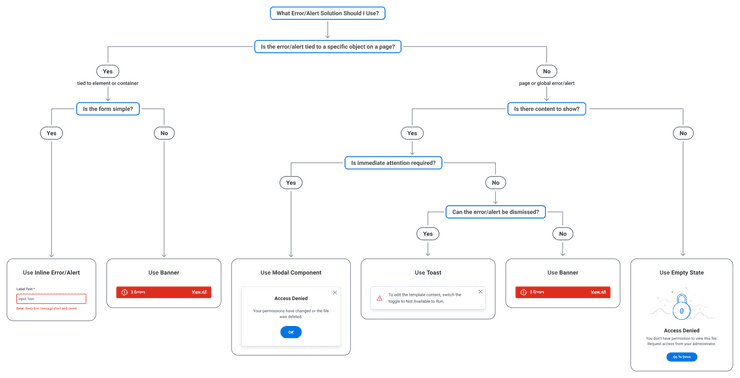
Error and alert messages should appear inline, at the element-level whenever possible. This allows users to easily locate and associate what inputs need attention, particularly in forms. Dynamic inline error and alert validation helps users immediately address issues in the order by which the form was designed.
Things to Consider
Banners build on the inline error/alert functionality by providing an additional visual indicator of the total number of errors and alerts on a page as well as a means to navigate to inline errors and alerts on the page.
Banner
Banners provide the user with a total count of all errors and alerts on the page. Activating the Banner opens a Modal component that lists all the errors and alerts on the page. Users can use this list to navigate directly to the inline errors and alerts on the page.
When to Use
Use Banners for complex form validation. Because Banners accommodate both inline and page-level errors and alerts, as well as specific treatments for container variations, such as errors in Tables or Modals, it is a great default solution for all error and alert messaging needs. Banners and their corresponding error messages prevent the user from moving forward in their process until the error is corrected. The UI persists the Banner and error message until the issue is resolved.
When to Use Something Else
Simple forms composed of only a few inputs can leverage inline error/alert treatment without additional visual indicators. Use your best judgement on whether a Banner is needed.
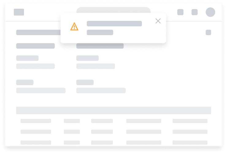
If you want to present users with an alert message that is easily dismissible and less intrusive, consider using a Toast.
Toasts
Toasts present dismissable alert messages at a fixed position on a page. Toasts can be transient or dismissible. Transient Toasts automatically dismiss and don’t receive keyboard focus as they don’t contain anything actionable. Dismissable Toasts have an “X” in the upper right corner that allows the user to dismiss the notification.
When to Use
Use Toasts for low-emphasis alert messages that do not require user action.
When to Use Something Else
Use Banners for error messages where action is required. Because Toast messages always appear at a fixed position at the top of the page, Banners are better suited for form validation alerts which can place the message inline fixed to specific elements. Banners are also the better option for alert messages that you don’t want users to easily dismiss.
Use a Modal component when you want to prompt a user to take action, such as refreshing a page.
Modal Component
A Modal component prevents a user from interacting with any other elements on the screen until the user has taken action to confirm or dismiss the message.
When to Use
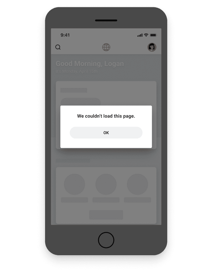
Use Modals to provide page-level or global error and alert messages that don’t pinpoint to specific elements on the page. In this example, the application experienced an issue while trying to load the next page. Rather than present the user with an error on a blank page, the Modal component intercepts the user before navigating away from the current page. The user can then close the Modal to return to the page they were on.
When to Use Something Else
Use Banners for form validations where error and alert messages apply to specific elements on a page.
Empty States
When to Use
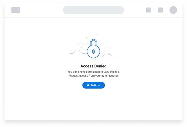
Use Empty State illustrations to communicate roadblocks in a user’s process where there is no content to show. When possible, they should explain the next steps the user should take and provide guidance with a clear call-to-action, such as a Button. Empty States can be applied when an entire page fails to load or within a container. The imagery in the Empty State is decorative and must not be exposed to assistive technology like a screen reader.
In this example, the Empty State tells the user that they don’t have access to the content and suggests the user contact their administrator to get access. The Empty State also provides a way for the user to return to Drive.
References
- Simone Ehrlich, Write Ridiculously Helpful Error and Alert Messages (Medium, 2018)
- Understanding success criterion 3.3.1 | Understanding WCAG 2.0
Related Documentation
| Components | Design Patterns |
|---|---|
| Banners | Notifications |
| Toasts | Forms |
| Modals | |
| Tables |
Can't Find What You Need?
Check out our FAQ section which may help you find the information you're looking for.
FAQ Section
