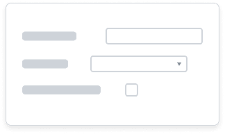
Forms
Forms consist of thoughtfully formatted inputs that enable users to make selections and submit information easily and efficiently.
Input Anatomy by Type
Inputs collect data from users within a form. It’s important to choose the right input to elicit a response in the format you want. Although an overview of input types is included here, follow the links to the component articles below for more detailed information on the specific components discussed.
Free-text Inputs
| Name | Visual | Usage | Example |
|---|---|---|---|
| Text Input |

| Enter text no longer than a single line. One of the most common ways for users to enter and edit text in forms. | Names, address, phone number |
| Text Area |
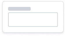
| Enter and edit multiple lines of text. | Comments, feedback |
| Color Input |

| Enter a value in a hexadecimal formal to apply a specific color to an element. | Assigning color values to data visualizations |
Selection Inputs
Selection inputs allow users to make selections from a predefined list of options. How users make selections varies by component. System icons are used to signify the component’s abilities, such as a calendar icon for a Date Input or a caret for Select. These icons provide an affordance to access functionality such as activating the Date Input calendar picker.
| Name | Visual | Usage | Example |
|---|---|---|---|
| Date Input |

| Enter date manually or by selecting a date using the calendar widget. | Choosing a start and end date |
| Select |

| Choose one option from a predefined list of items (7-15 options). | Selecting a time type for Time Off |
| Combobox/Prompt |

| Allows users to search for or browse through folders to select one or many options from a predefined list. Use when there are >15 items to choose from or when the dataset of items is unpredictable. | Selecting one or several workers to give feedback to. Selecting an expense item. |
| Color Picker |
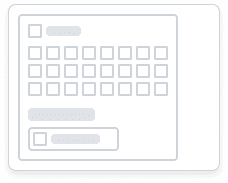
| Allows users to enter a value in a hexadecimal formal or select one from a predefined list of color swatches to apply a specific color to an element. | Apply a background color to a presentation slide. |
Selection Controls
Selection controls present users with predefined options to select from. Unlike selection inputs, selection controls expose all options to the user upfront and do not require the user to enter text or activate a menu to make selections.
Radio Buttons and Checkboxes can be standalone or programmatically grouped together into a Radio Group or a Checkbox Group, with an associated legend or description. This wraps the set of Checkboxes or Radio Buttons in a fieldset in close proximity to their label.
| Name | Visual | Usage | Example |
|---|---|---|---|
| Radio Buttons |
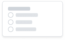
| Select one value from a predefined list of 7 or fewer options that are mutually exclusive. Don’t use radio buttons to toggle items on or off. | Android or iOS device, Full-time or part-time worker |
| Check Boxes |

| Select zero, one, or multiple values from a predefined list of 7 or less options. Checkboxes in a group imply that items are related. | Select all that apply, agree to conditions |
| Switch |

| Used to switch between two potential states such as enable or disable a feature or mode, or turn an item on or off. | Toggle touch ID for login on or off |
Placeholder Text
Placeholder text should only serve as a supplementary visual indicator and should never replace a visible label for an input. Placeholder text should be neutral and anonymous. Never use real values. Placeholder text should also pass color contrast in accordance with WCAG Success Criteria 2.1 1.4.3.
Placeholder text can be used to:
- Provide an example of the data format used inside the field while the input is empty. For example, Date Input includes placeholder text “MM/DD/YYYY” to instruct users to enter the correct date format for this input. Use placeholder text when formatting is in question or when the input may be unfamiliar to the user. Try to avoid using placeholder text that could be confused with a real value.
- Prompt user action by providing instructions. For example, a Select component prompts a user to select one option from the predefined list of options. The placeholder text also informs users of the functionality of the component, as they can only select one value rather than many.
Form Anatomy
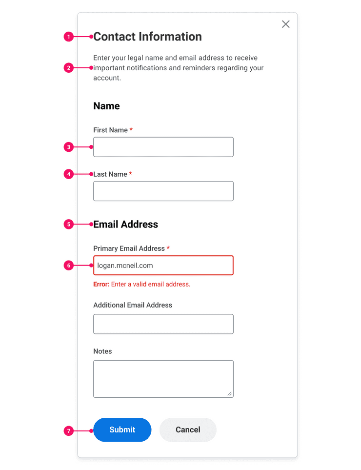
A basic form is composed of the following parts:
- Form Title: Title or brief description of the form. Positioned at the top of the page or container.
- Instructional Text (Optional): Text applied to the top of the form or inline to help users understand how to complete the form, indicate any required or optional input, and other necessary information that can reduce confusion and minimize the chance of errors. When deciding whether to include instructional text, refer to the Instructional Text section of the Content Style Guide.
- Inputs: Components which enable users to enter text and make selections. Visit individual component pages for specific details on these components. Inputs should be placed in a logical order that follows standard conventions, such as putting the Text Input for First Name before Last Name. Keep input labels concise and to the point to help users understand what information is being requested of them. For more detailed information, refer to the Content Style Guide for Field Labels, Drop-Down Menus, and Radio Buttons.
- Required Inputs: Required fields are marked with a red asterisk. If a value is not selected when the user submits their form, an error message is triggered in response. Required attributes must be applied to required fields for screen readers.
- Section Title (Optional): Long forms with many fields can be overwhelming. Grouping related fields can help users make sense of information they need to enter. These groups help users focus on smaller, more manageable tasks and makes it easier for users to scan the form.
- Inline Error and Alert messages: Errors and alerts that are associated to specific elements on the page use a combination of message and visual cues to help the user locate and address them. If possible, provide immediate inline validation when a user shifts focus from an input. This allows the user to fix these issues quickly and proceed in filling out their form in a linear order. More detailed information on error and alert messages, as well as examples, can be found in the pattern article on Errors and Alerts.
- Action Buttons: Allows users to submit or leave the form. Action buttons should be clear and obvious and are a crucial component to allow your user to submit their form or advance in their process. Use Primary Buttons for main actions and Secondary Buttons for additional actions such as Cancel.
Multi-step Forms
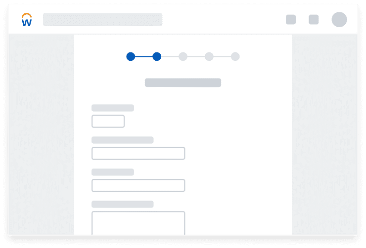
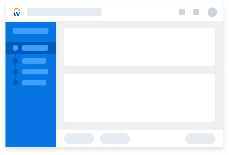
Divide long forms into a series of steps to prevent overwhelming the user. Group inputs together logically and make optional sections easy to recognize and skip. Instructions should be provided in advance for what users may need, especially if forms are collecting personal data and legal requirements need to be met. Progress indicators inform the user upfront about the number of steps in the form and communicate how much has been completed and what remains to be completed. If time limits are required, provide a way for users to adjust or extend the time limit to continue progress on the form.
Side-Aligned vs. Top-Aligned Labels
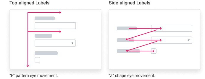
Input label alignment can also affect how a user fills out a form. Inputs support two label variations: side and top labels.
Side-Aligned Labels
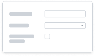
Side-aligned labels take advantage of horizontal white space and can reduce the amount of vertical scrolling on larger web experiences. Because these labels are closer in proximity to each other, it is easier for users to scan forms with side-aligned labels when users are looking to update specific values in a form.
Do
Labels should be close to its respective input or control and should stack consistently with other form inputs. Max widths set on left/right-aligned labels should provide this for free.
Long left/right-aligned labels are more difficult to scan. Because of this, it is best practice to make left/right-aligned labels concise. Labels should be closely positioned to their inputs so the user can easily relate the label to the correct input.
Top-Aligned Labels
Top-aligned labels have several advantages, including close proximity between label and input and the affordance to accommodate longer labels. Top-aligned labels provide the least visual distance They are ideal for Modal components, Side Panel containers, and on smaller screens such as mobile. Top-aligned labels typically allow for faster form completion when the form is asking for common pieces of information users are familiar with, such as their name, address, and phone number. Native mobile always uses top-aligned labels.
Since labels are consistently aligned and inputs are stacked directly below each input, the eye only has to move top-down versus the multi-directional “z-shape” scanning involved with left/right-aligned labels.
Top-aligned labels can make your form appear longer, especially if section titles are used to break up your form. Therefore, left/right-aligned labels are the better option for denser forms where more inputs are needed.
Disabling vs. Hiding Inputs
- Disable an input if a user needs to see an item but does not have access to it. The input is then displayed but cannot be edited and visually appears greyed out to diminish its level of importance.
- Hide inputs if a user doesn’t have access to and doesn’t need to see an item. Only providing the user with the inputs they need and have access to can help reduce clutter in a form and lower the cognitive load on a user.
Errors and Alerts
Users most commonly encounter errors and alerts when filling out forms. Forms can validate errors and alerts dynamically or on submit. Please refer to the pattern article on Errors and Alerts for more detailed guidelines on error message hierarchy and different types of error and alert solutions.
- Input border colors change when an error or alert is applied.
- Input border colors must meet a 3:1 color contrast against the background.
- Inline error and alert validations must be associated to the input field for screen readers and appear as text in close proximity to the input which the error is tied to.
Mobile
Because space is limited on mobile, forms must be optimized so that they are as functional and easy to view as on larger screens.
- Native mobile uses top-aligned labels. Inputs extend the full-width of the screen, making them large enough to display the user’s inputted text or selection. This also ensures touch targets are large enough and spaced out enough to reduce potential user tap-target error.Refer to the WCAG Success Criteria 2.5.5 on Target Size to ensure touch targets are large enough for users to easily activate them.
- To reduce the amount of vertical scrolling, ordering inputs in your form becomes especially important.
- Most often, a single-column layout should be used on mobile devices. Multiple-column form layouts on smaller devices may overwhelm the user who is trying to process a lot of information on a small screen.
Related Documentation
| Components | Design Patterns |
|---|---|
| Check Box | Errors and Alerts |
| Color Input | |
| Radio Button | |
| Select | |
| Switch | |
| Text Area | |
| Text Input |
Can't Find What You Need?
Check out our FAQ section which may help you find the information you're looking for.
FAQ Section
