Notifications
Notifications communicate relevant and timely information to users in response to user action or through system-generated messages.
Message Types
Notifications can be organized by type based on a combination of two factors: whether the message is system-generated or user-generated, and whether the notification is passive or actionable. These message types influence the notification’s level of prominence.
System-generated or User-generated
- System-generated notifications are messages sent by the application that are independent of user action.
- User-generated notifications appear in direct response to user action. They provide immediate feedback in context of the page the user is working on.
Passive or Actionable
- Passive notifications provide information to the user but don’t require the user to take action.
- Actionable notifications can require immediate action to move forward in a process (such as Error Banners), or present a user with the option to see further details or perform another action (such as Toasts with a link to “View more details”).
| Generated By | Passive or Actionable | Example |
|---|---|---|
| System | Passive | Notification about a system update or system outage. |
| System | Actionable | Session Timeout Modal: User’s session has timed out. Prompts the user to log back in before the user can proceed with other tasks. |
| User | Passive | Success Toast: “Your expense was submitted.” |
| User | Actionable | Error Banner: “Enter an end date that is in the future.” New Features Dialog: A Dialog component alerts the user of a new feature or enhancement. The user does not have to take immediate action on the Dialog as the page is not obstructed by an overlay. |
Notification States
Notifications often use an icon as a supplementary visual indicator for different message states. Color can also evoke certain states, like using red for error messages and green for success messages. However, never use color alone to differentiate between these states. Refer to the guidelines in the Canvas Accessible Practices section of the site for more information.
| State | Icon | Associated Color | Purpose |
|---|---|---|---|
| Success |

| Green Apple 500 | Positive confirmation of status, such as an action or task completed successfully. |
| Error |

| Cinnamon 500 | Indicates immediate attention is required. Prevents advancement until action is taken to resolve the issue. |
| Alert |

| Cantaloupe 400 Please note that this color does not meet a 3:1 contrast ratio to adjacent colors according to WCAG 1.4.11 success criterion. The corresponding message must clearly communicate that this is an alert. | Prompts user attention but doesn’t require action. Alert messages may help the user avoid errors. |
| Info |

| Blueberry 400 | Used for general informational messages with neutral status. |
Transient, Dismissible, and Persistent Behavior
Transient
Transient notifications provide supplemental status updates. They automatically dismiss after a short period of time. They don’t receive keyboard focus, and don’t contain anything actionable.
Dismissible
Dismissable Toasts have an “X” in the upper right corner that allows the user to dismiss the notification.
When a dismissable notification is loaded it should receive keyboard focus. Dismissible notifications can be dismissed by an X icon or an explicit button if the solution calls for it. However, not all notifications can be explicitly dismissed by the user, such as error messages, which require users to resolve the issue before proceeding.
Explicit Dismiss
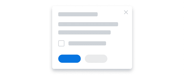
Sometimes notifications will have a more explicit dismiss, such as in Dialog components, where a checkbox serves as a double-confirmation in the content area, allowing the user to configure their notification cadence. An example of this double-confirmation is the “Do not show again” checkbox that prevents the Dialog from showing again in future sessions.
Not Dismissible
Error Banners persist until all errors on a page have been resolved.
Accessibility Considerations
- Transient (automatically disappearing) toasts may be very easy for low vision users to miss with magnification software. This pattern must not be used for higher emphasis messages.
- Avoid stacking multiple dismissible toasts. Manually dismissing notifications requires cognitive and physical effort.
- After a notification has been manually dismissed, set keyboard focus to a logical element in the page. This practice helps guide users and maintain their context.
- Color must never be used as the only way to communicate notification error and warning states. Use color to support icons and text within a notification to convey its state.
Screen Reader Notifications
Supplemental Information is sometimes necessary to help screen reader users understand live changes to page content in real time. On the web, this type of notification is known as a “Live Region”. When a live region is created, screen readers will watch the area for any content changes and announce them to users in real time according to one of two possible rules:
politewill “politely” wait for users to finish what they are doing before announcing a live region changeassertivewill interrupt what users are doing by immediately announcing a live region change
Live regions take control of the user experience away from users, placing it squarely into the hands of developers. Therefore, live regions should be used with thoughtful intent due to the risk of causing harm to users who depend on screen reading technology.
- Live regions can be completely hidden from a visual design, or they can also be created around visible dynamic text in the design for both sighted and non-visual users.
- A live region change will only be announced once. Users are unable to repeat them or re-examine them if the announcement was not understood.
- Users may be able to pause a live region announcement, but they cannot prevent a live region announcement from occurring. Sending frequent and repetitive updates to a live region can be very disruptive to users.
- Users cannot act on, or navigate to, a live region. Live regions must only contain plain text. (No images, links, buttons, or other input.)
- Support for live regions is limited across platforms, browsers, and screen reader software. Real time announcements may not be perfectly reliable.
Deciding What to Use
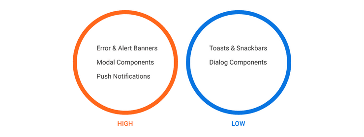
Notifications can be categorized from high to low attention and directly correlate to the behavior and interface of the solution.
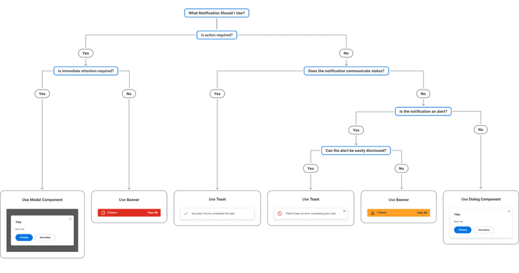
Use the decision tree below as a guide to determine what UI solution should be used for your use case. Although high-level guidelines on these solutions are provided below the tree, we encourage you to read more details on the notifications listed here by following the links to the respective component and pattern pages.
Error and Alert Banner
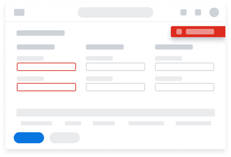
Error and Alert Banners notify users of missteps that happen within a workflow and describe how the user can take appropriate action to resolve them. Activating the Banner opens a Modal component that lists all the errors and alerts on the page.
When to Use
Because Banners accommodate both inline and page-level errors, as well as specific treatments for container variations, such as errors in Tables or Modal components, it is a great default solution for all error and alert messaging needs.
When to Use Something Else
Alerts are considered “soft errors” because the user is not required to take action on the message to proceed. If you wish to present users with an alert message that is less intrusive or demanding, consider using a Toast with the alert variation. Toasts provide a more lightweight experience and are easy to dismiss.
Modal Components
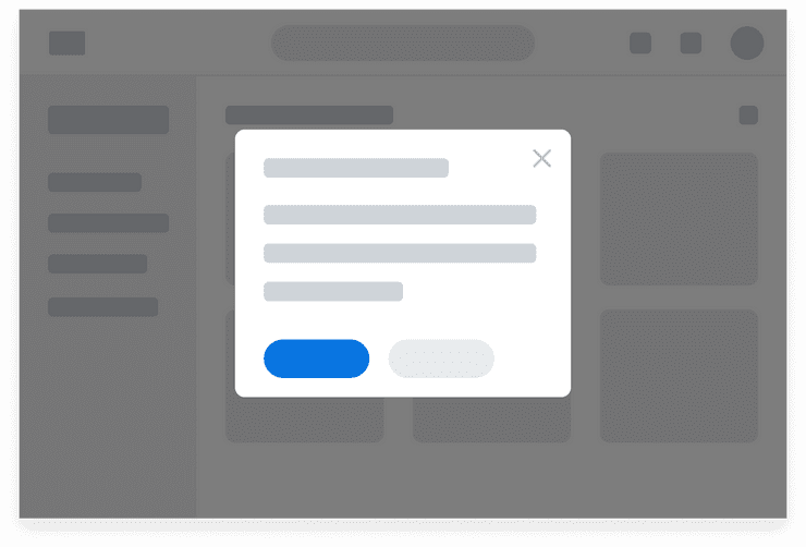
Alert Modals are a specific type of Modal component, also known as Modal Dialogs, used to inform the user about situations that require acknowledgement, often when something goes wrong. Alert Modals are a conversation between the system and the user, composed of simple and short messaging that is important or related to the current workflow. All Alert Modals require user action to confirm or dismiss before the user can proceed with other tasks or workflows.
When to Use
Modal components, also known as Modals, remain on screen until explicit action is taken to confirm or dismiss. Because Modals are purposefully interruptive and command user attention, they are best used to communicate critical information or prompt the user to make a decision without leaving the current page. It is important to note that Modals serve use cases outside of notifications as well. Modals are often used to give users the ability to complete tasks in the same context rather than taking users to a separate page.
When to Use Something Else
Because Modal components use an overlay and cannot be moved from their position, it can be frustrating for a user to close the Modal to reference information on the page. The user can use the buttons on the Modal or click outside of the Modal container to close it and return to the page. Use a Dialog component to display a notification that is easy to close and dismiss.
Push Notifications
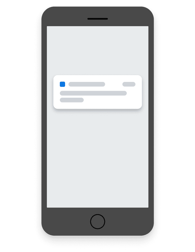
Push Notifications send mobile users concise, timely messages that are relevant, informative, and actionable.
When to Use
Because many people have their mobile devices nearby, Push Notifications can be particularly useful to announce an event or the availability of something new or relevant at any time of day. Push Notifications are generally not triggered by a user’s own action.
Things to Consider
When too many Push Notifications are sent in a given day or in rapid succession, users may feel overwhelmed and be less likely to engage with the application. This is especially true if the messages are too generic or use technical jargon. Send fewer notifications and make sure they are concise, relevant, and meaningful.
Toasts & Snackbars
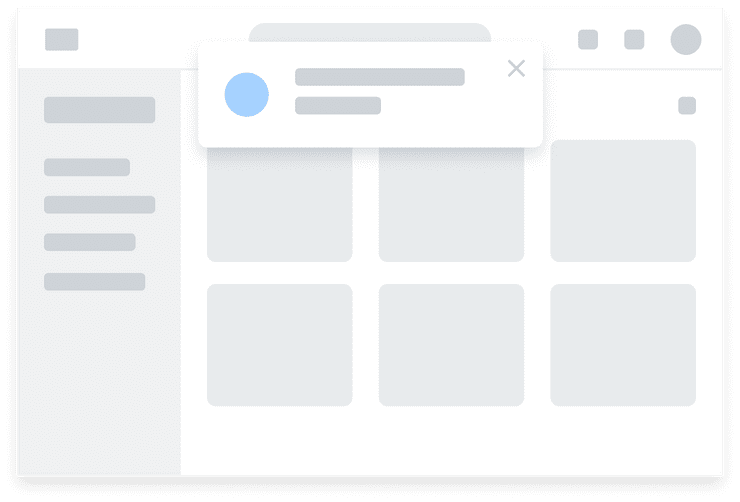
Toasts contain less invasive messages that will either auto-dismiss (Transient toast) or can be manually dismissed by users. A Snackbar is a mobile variation of toasts.
When to Use
Use Toasts for low-emphasis messages, alerts, and to communicate the status of an application’s process, such as save and success messages.
Transient Toasts
- Automatically disappearing notifications may be appropriate if users can reach the same conclusion from elsewhere on the page.
- Should be considered whenever a change is made to a page that doesn’t also result in a change in keyboard focus.
- Keyboard support is not necessary. Transient toasts do not have any interactive elements in the notification.
Dismissable Toasts
- Manually dismissable notifications are appropriate when the notification requires acknowledgement or interaction.
- Keyboard support is required. Users must be able to navigate to, and interact with the notification without a mouse or trackpad.
When to Use Something Else
Use Banners for error messages where action is required. Use Modal components to inform users about critical information.
Dialog Components
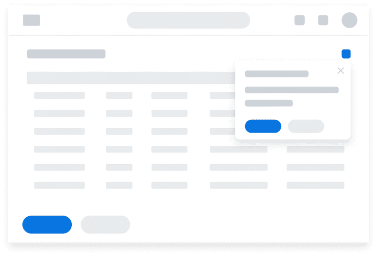
Dialog components, also referred to as Non-Modal Dialogs, appear within the context of a page and do not interrupt normal workflow.
When to Use
Because Dialogs only minimally obstruct the page, they are ideal for drawing attention to optional, non-critical information or new features while keeping page content still visible. Popovers are a variation of Dialogs that always position around a triggering element. It is important to note that Dialog components serve use cases outside of notifications as well. For example, Popovers are used to display help text on an Input.
When to Use Something Else
Dialog components, by nature, are easy to close and dismiss. If you require user attention, consider using a Modal component.
Can't Find What You Need?
Check out our FAQ section which may help you find the information you're looking for.
FAQ Section

